- ADF renderer
- Atlassian icon (Preview)
- Atlassian tile (Preview)
- Badge
- Box
- Button
- Button group
- Calendar
- Chart - Bar
- Chart - Donut
- Chart - Horizontal bar
- Chart - Horizontal stack bar
- Chart - Line
- Chart - Pie
- Chart - Stack bar
- Checkbox
- Checkbox group
- Code
- Code block
- Comment
- Comment editor
- Chromeless editor
- Date picker
- Dynamic table
- Empty state
- File card (EAP)
- File picker (EAP)
- Form
- Frame
- Heading
- Icon
- Image
- Inline
- Inline edit
- Link
- List
- Lozenge
- Modal
- Popup
- Pressable
- Progress bar
- Progress tracker
- Radio
- Radio group
- Range
- Section message
- Select
- Spinner
- Stack
- Tabs
- Tag
- Tag group
- Text
- Text area
- Text field
- Time picker
- Tile (Preview)
- Toggle
- Tooltip
- User
- User group
- User picker
- XCSS
File picker (EAP)
UI components for Forge Object Store are now available as part of our Early Access Program (EAP). These components can also be used for remote object store back-ends. To start testing, sign up here.
By signing up for this Early Access Program (“EAP”), you acknowledge that use of the Forge Object Store UI Components is governed by the Atlassian Developer Terms. The Forge Object Store UI Components are considered “Early Access Materials”, as set forth in Section 10 of the Atlassian Developer Terms and is subject to applicable terms, conditions, and disclaimers.
For more details, see Forge EAP, Preview, and GA.
Supported Modules
This is supported in Bitbucket, Confluence, Jira, and Jira Service Management modules during EAP.
To add the FilePicker component to your app:
1
2import { FilePicker } from "@forge/react";
Description
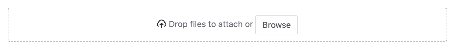
The file picker allows the user to select files stored locally.
You can use the file card component to display selected files (along with information about each file and upload progress).
Example app
We published a sample app to demonstrate the basics of implementing object storage features in a Forge app. This sample app uses the Forge Object Store as its backend and available Forge UI components for its frontend. Refer to the app's README for additional guidance on exploring and testing the code.
Props
| Name | Type | Required | Description |
|---|---|---|---|
description | string | No | Additional helper text shown below the file picker to guide users. |
label | string | No | Label displayed above the file picker. |
onChange | (files: SerializedFile[]) => void | No | Callback triggered when files are selected; receives an array of serialized files. |
Examples
Default
The onChange property receives an array of serialized files and can be used to manage the selected files:
1
2type SerializedFile = {
  data: string;
  name: string;
  size: number;
  type: string;
}
1
2export const FilePickerExample = () => {
  const [files, setFiles] = useState([]);

  const onChange = (files) => {
    const unserializedFiles = ...
    setFiles(unserializedFiles);
  };

  return <FilePicker onChange={onChange} />;
};
Additional Elements
Use label to display text above the file picker input zone, helping users identify the purpose of the field. Use description to provide additional helper text (for example, allowed file types or size limits).
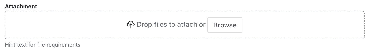
1
2const FilePickerWithElementsExample = () => {
  return (
    <FilePicker
      label="Attachment"
      description="Hint text for file requirements"
    />
  );
};
Rate this page: