- ADF renderer
- Atlassian icon (Preview)
- Atlassian tile (Preview)
- Badge
- Box
- Button
- Button group
- Calendar
- Chart - Bar
- Chart - Donut
- Chart - Horizontal bar
- Chart - Horizontal stack bar
- Chart - Line
- Chart - Pie
- Chart - Stack bar
- Checkbox
- Checkbox group
- Code
- Code block
- Comment
- Comment editor
- Chromeless editor
- Date picker
- Dynamic table
- Empty state
- File card (EAP)
- File picker (EAP)
- Form
- Frame
- Heading
- Icon
- Image
- Inline
- Inline edit
- Link
- List
- Lozenge
- Modal
- Popup
- Pressable
- Progress bar
- Progress tracker
- Radio
- Radio group
- Range
- Section message
- Select
- Spinner
- Stack
- Tabs
- Tag
- Tag group
- Text
- Text area
- Text field
- Time picker
- Tile (Preview)
- Toggle
- Tooltip
- User
- User group
- User picker
- XCSS
Inline edit
To add the InlineEdit component to your app:
1
2import { InlineEdit } from "@forge/react";
Description
An inline edit displays a custom input component that switches between reading and editing on the same page.
The InlineEdit component implementation contains a form element and should not be used within the Form component, as it breaks the accessibility guidelines and can cause unexpected behavior in the browser.
For more information, see Accessibility Guidelines
Props
| Name | Type | Required | Description |
|---|---|---|---|
cancelButtonLabel | string | No | Accessibility label for the cancel action button. |
confirmButtonLabel | string | No | Accessibility label for the confirm action button, which saves the field value into editValue. |
defaultValue | any | Yes | The user input entered into the field during editView. This value is updated and saved by onConfirm. |
editButtonLabel | string | No | Accessibility label for button, which is used to enter editView from keyboard. |
hideActionButtons | boolean | No | Sets whether the confirm and cancel action buttons are displayed in the bottom right of the field. |
isEditing | boolean | No | Sets whether the component shows the readView or the editView. This is used to manage the state of the input in stateless inline edit. |
isRequired | boolean | No | Determines whether the input value can be confirmed as empty. |
keepEditViewOpenOnBlur | boolean | No | Sets the view when the element blurs and loses focus (this can happen when a user clicks away). When set to true, inline edit stays in editView when blurred. |
label | boolean | No | Label above the input field that communicates what value should be entered. |
onCancel | () => void | No | Exits editView and switches back to readView. This is called when the cancel action button (x) is clicked. |
onConfirm | (value: any) => void | Yes | Saves and confirms the value entered into the field. It exits editView and returns to readView. |
onEdit | () => void | No | Handler called when readView is clicked. |
readViewFitContainerWidth | boolean | No | Determines whether the readView has 100% width within its container, or whether it fits the content. |
startWithEditViewOpen | boolean | No | Determines whether it begins in editView or readView. When set to true, isEditing begins as true and the inline editstarts in editView. |
validate | (value: any) => string | void | Promise<string | void> | No | Displays an inline dialog with a message when the field input is invalid. |
Examples
Default
Inline edit is a wrapper around a custom input component such as a text field. It starts in a read-only view called readView and people can activate the field to edit it.
To prevent an inconsistent transition between read and edit mode, pass in custom readView and editView as props. Not doing this will result in a buggy user experience where the inline edit views do not align.
You can use various types of input fields such as text area and select. The appearance of the inline edit will vary depending on the input component it is used with.
Text field

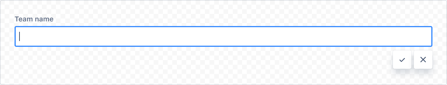
1
2import React, { useState } from "react";
import { Textfield, Box, xcss, InlineEdit } from "@forge/react";

const readViewContainerStyles = xcss({
  paddingInline: "space.075",
  paddingBlock: "space.100",
});

const InlineEditTextfieldExample = () => {
  const [editValue, setEditValue] = useState("");
  return (
    <InlineEdit
      defaultValue={editValue}
      label="Team name"
      editView={({ errorMessage, ...fieldProps }) => (
        <Textfield {...fieldProps} autoFocus />
      )}
      readView={() => (
        <Box xcss={readViewContainerStyles}>
          {editValue || "Enter your team name"}
        </Box>
      )}
      onConfirm={(value) => setEditValue(value)}
    />
  );
};
Text area
The text area example uses keepEditViewOpenOnBlur. When set to true, inline edit stays in editing when blurred (when the user clicks or moves away). This is recommended for larger areas of text to help prevent people from accidentally discarding or saving their unfinished work.

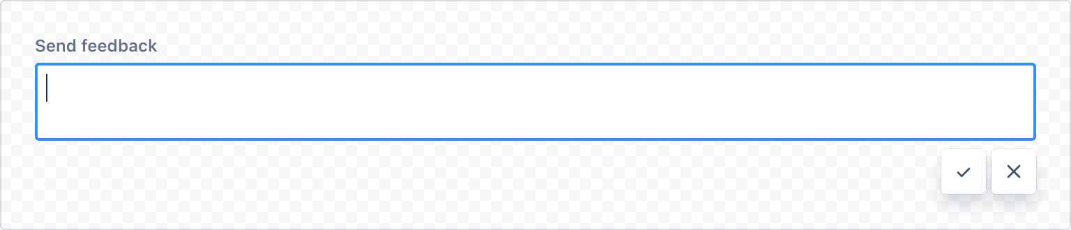
1
2import React, { useState } from "react";
import { Box, xcss, InlineEdit, TextArea } from "@forge/react";

const readViewContainerStyles = xcss({
  paddingInline: "space.075",
  paddingBlock: "space.100",
});

const InlineEditTextareaExample = () => {
  const [editValue, setEditValue] = useState("");
  return (
    <InlineEdit
      defaultValue={editValue}
      label="Send feedback"
      editView={({ errorMessage, ...fieldProps }) => (
        <TextArea {...fieldProps} />
      )}
      readView={() => (
        <Box xcss={readViewContainerStyles}>
          {editValue || "Tell us about your experience"}
        </Box>
      )}
      onConfirm={setEditValue}
      keepEditViewOpenOnBlur
      readViewFitContainerWidth
    />
  );
};
Select

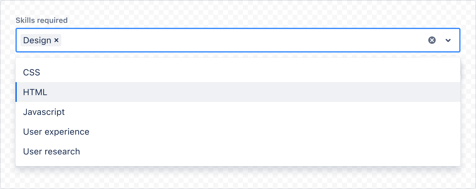
1
2import React, { useState } from "react";
import { Box, xcss, InlineEdit, Select, Tag, TagGroup } from "@forge/react";

const readViewContainerStyles = xcss({
  paddingInline: "space.075",
  paddingBlock: "space.100",
});

const tagGroupContainerStyles = xcss({ padding: "space.050" });

const selectOptions = [
  { label: "CSS", value: "CSS" },
  { label: "Design", value: "Design" },
  { label: "HTML", value: "HTML" },
  { label: "Javascript", value: "Javascript" },
  { label: "User experience", value: "User experience" },
  { label: "User research", value: "User research" },
];

const InlineEditSelectExample = () => {
  const [editValue, setEditValue] = useState([]);

  const onConfirm = (value) => {
    if (!value) {
      return;
    }

    setEditValue(value);
  };

  return (
    <InlineEdit
      defaultValue={editValue}
      label="Skills required"
      editView={(fieldProps) => (
        <Select
          {...fieldProps}
          options={selectOptions}
          isMulti
          autoFocus
          openMenuOnFocus
        />
      )}
      readView={() => (
        <>
          {!!(editValue && editValue.length === 0) ? (
            <Box xcss={readViewContainerStyles}>Select options</Box>
          ) : (
            <Box xcss={tagGroupContainerStyles}>
              <TagGroup>
                {editValue &&
                  editValue.map((option) => (
                    <Tag text={option.label} key={option.label} />
                  ))}
              </TagGroup>
            </Box>
          )}
        </>
      )}
      onConfirm={onConfirm}
    />
  );
};
No action buttons
Action buttons include a confirm (checkmark) and a cancel (cross) button. These indicate the completion of editing and the cancellation of editing respectively.
Use hideActionButtons to remove the buttons and leave the field by itself. Use this when the action buttons obstruct other contents below. For example, on mobile devices.
If there's no obstruction, keep action buttons for accessibility purposes. The contents in the field are saved when the user navigates away from the element, but this isn't immediately obvious on its' own.
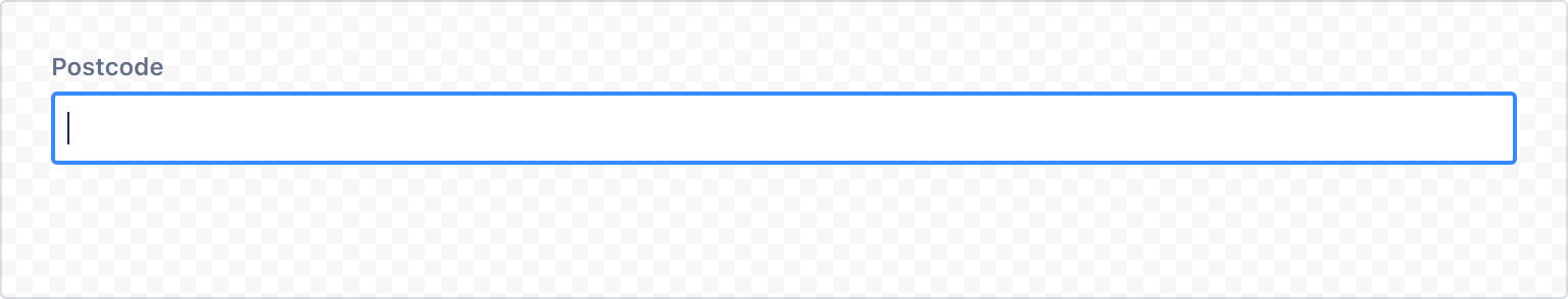
1
2import React, { useState } from "react";
import { Textfield, Box, xcss, InlineEdit } from "@forge/react";

const readViewContainerStyles = xcss({
  paddingInline: "space.075",
  paddingBlock: "space.100",
});

const InlineEditTextfieldExample = () => {
  const [editValue, setEditValue] = useState("");
  return (
    <InlineEdit
      defaultValue={editValue}
      label="Postcode"
      editView={({ errorMessage, ...fieldProps }) => (
        <Textfield {...fieldProps} autoFocus />
      )}
      readView={() => (
        <Box xcss={readViewContainerStyles}>
          {editValue || "Enter your postcode"}
        </Box>
      )}
      onConfirm={(value) => setEditValue(value)}
      hideActionButtons
    />
  );
};
Start with edit view
Inline edit starts in readView by default. You must click into the field to start editing.
Use startWithEditViewOpen to set it to start in editView instead.

1
2import React, { useState } from "react";
import { Textfield, Box, xcss, InlineEdit } from "@forge/react";

const readViewContainerStyles = xcss({
  paddingInline: "space.075",
  paddingBlock: "space.100",
});

const InlineEditTextfieldExample = () => {
  const [editValue, setEditValue] = useState("");
  return (
    <InlineEdit
      defaultValue={editValue}
      label="Team name"
      editView={({ errorMessage, ...fieldProps }) => (
        <Textfield {...fieldProps} autoFocus />
      )}
      readView={() => (
        <Box xcss={readViewContainerStyles}>
          {editValue || "Enter your team name"}
        </Box>
      )}
      onConfirm={(value) => setEditValue(value)}
      startWithEditViewOpen
    />
  );
};
Validation
Validation displays an error message related to the restrictions of the inline edit.
These error and warning messages disappear when the criteria is met.
Try to keep the helper text as short as possible. For complex information, provide a link to more information in a new browser tab (see messaging guidelines for more information).
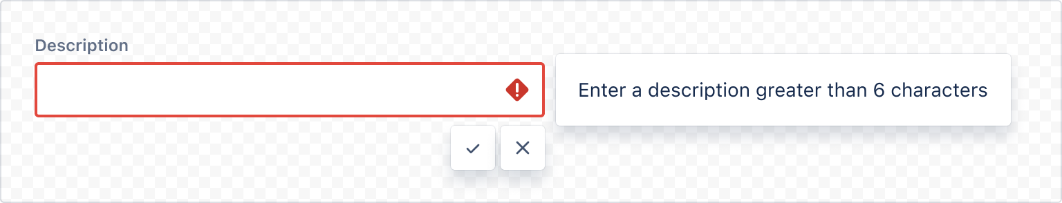
1
2import React, { useState } from "react";
import { Popup, Box, xcss, InlineEdit, Textfield, Icon } from "@forge/react";

const readViewContainerStyles = xcss({
  paddingInline: "space.075",
  paddingBlock: "space.100",
});

const containerStyles = xcss({
  paddingBlockStart: "space.100",
  paddingInlineEnd: "space.100",
  paddingBlockEnd: "space.600",
  width: "50%",
});

const popupContentStyles = xcss({
  padding: "space.200",
});

const errorIconContainerStyles = xcss({
  paddingInlineEnd: "space.075",
});

const InlineEditValidationExample = () => {
  const [editValue, setEditValue] = useState("");
  let validateValue = "";
  let validateTimeoutId: number | undefined;

  const validate = (value: string) => {
    validateValue = value;
    return new Promise<{ value: string; error: string } | undefined>(
      (resolve) => {
        validateTimeoutId = window.setTimeout(() => {
          if (value.length <= 6) {
            resolve({
              value,
              error: "Enter a description greater than 6 characters",
            });
          }
          resolve(undefined);
        }, 100);
      }
    ).then((validateObject) => {
      if (validateObject && validateObject.value === validateValue) {
        return validateObject.error;
      }
      return undefined;
    });
  };

  return (
    <Box xcss={containerStyles}>
      <InlineEdit
        startWithEditViewOpen
        defaultValue={editValue}
        label="Description"
        editView={({ errorMessage, ...fieldProps }) => (
          <Popup
            shouldRenderToParent
            shouldDisableFocusLock
            isOpen={fieldProps.isInvalid}
            placement="right"
            autoFocus={false}
            content={() => <Box xcss={popupContentStyles}>{errorMessage}</Box>}
            trigger={() => (
              <Textfield
                {...fieldProps}
                elemAfterInput={
                  fieldProps.isInvalid && (
                    <Box xcss={errorIconContainerStyles}>
                      <Icon
                        glyph="error"
                        label="error"
                        primaryColor={"color.icon.danger"}
                      />
                    </Box>
                  )
                }
                autoFocus
              />
            )}
          />
        )}
        readView={() => (
          <Box xcss={readViewContainerStyles}>
            {editValue || "Add a description"}
          </Box>
        )}
        onConfirm={(value) => setEditValue(value)}
        validate={validate}
      />
    </Box>
  );
};
Required field
Set isRequired when an inline edit field needs to be filled out to continue.
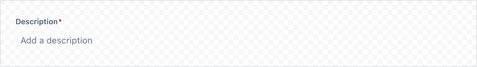
1
2import React, { useState } from "react";
import { Box, xcss, InlineEdit, Textfield } from "@forge/react";

const readViewContainerStyles = xcss({
  paddingInline: "space.075",
  paddingBlock: "space.100",
});

const InlineEditRequiredExample = () => {
  const [editValue, setEditValue] = useState("");
  return (
    <InlineEdit
      isRequired
      defaultValue={editValue}
      label="Description"
      editView={({ errorMessage, ...fieldProps }) => (
        <Textfield {...fieldProps} autoFocus />
      )}
      readView={() => (
        <Box xcss={readViewContainerStyles}>
          {editValue || "Add a description"}
        </Box>
      )}
      onConfirm={(value) => setEditValue(value)}
    />
  );
};
Stateless
In a stateless inline edit, you can manage the checked state of the input by using the isEditing prop.
This requires the setEditing handler to control the state value that you pass into the isEditing prop.

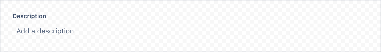
1
2import React, { useState } from "react";
import { Box, xcss, InlineEdit, Textfield } from "@forge/react";

const readViewContainerStyles = xcss({
  paddingInline: "space.075",
  paddingBlock: "space.100",
});

const InlineEditStatelessExample = () => {
  const [editValue, setEditValue] = useState("");
  const [isEditing, setEditing] = useState(true);

  return (
    <InlineEdit
      defaultValue={editValue}
      label="Description"
      isEditing={isEditing}
      editView={({ errorMessage, ...fieldProps }) => (
        <Textfield {...fieldProps} autoFocus />
      )}
      readView={() => (
        <Box xcss={readViewContainerStyles}>
          {editValue || "Add a description"}
        </Box>
      )}
      onCancel={() => setEditing(false)}
      onConfirm={(value: string) => {
        setEditValue(value);
        setEditing(false);
      }}
      onEdit={() => setEditing(true)}
    />
  );
};
Accessibility considerations
- For larger areas of text, set
keepEditViewOpenOnBlurto true. This ensures that inline edit stays in editing mode when the user clicks or moves away. This is recommended to help prevent people from accidentally discarding or saving their unfinished work. - Keep action buttons visible wherever possible. The contents in the field are saved when the user navigates away from the element, but this isn't immediately obvious on its' own.
- Make sure that inline edit fields have enough visual affordance that sighted people recognise them as editable, especially if you are using custom font sizing.
- Use inline edit for an editable field that is not part of a form. Don't use inline edit inside of a form.
Rate this page: