- ADF renderer
- Atlassian icon (Preview)
- Atlassian tile (Preview)
- Badge
- Box
- Button
- Button group
- Calendar
- Chart - Bar
- Chart - Donut
- Chart - Horizontal bar
- Chart - Horizontal stack bar
- Chart - Line
- Chart - Pie
- Chart - Stack bar
- Checkbox
- Checkbox group
- Code
- Code block
- Comment
- Comment editor
- Chromeless editor
- Date picker
- Dynamic table
- Empty state
- File card (EAP)
- File picker (EAP)
- Form
- Frame
- Heading
- Icon
- Image
- Inline
- Inline edit
- Link
- List
- Lozenge
- Modal
- Popup
- Pressable
- Progress bar
- Progress tracker
- Radio
- Radio group
- Range
- Section message
- Select
- Spinner
- Stack
- Tabs
- Tag
- Tag group
- Text
- Text area
- Text field
- Time picker
- Tile (Preview)
- Toggle
- Tooltip
- User
- User group
- User picker
- XCSS
Time picker
To add the TimePicker component to your app:
1
2import { TimePicker } from "@forge/react";
Description
A time picker allows the user to select a specific time.
Props
| Name | Type | Required | Description |
|---|---|---|---|
appearance | "default" | "subtle" | "none" | No | Set the appearance of the picker.subtle will remove the borders, background, and icon. |
aria-invalid | "true" | "false" | No | |
aria-labelledby | string | No | |
autoFocus | boolean | No | Set the picker to autofocus on mount. |
defaultIsOpen | boolean | No | The default for isOpen. |
defaultValue | string | No | The default for value. |
hideIcon | boolean | No | Hides icon for dropdown clear indicator. |
id | string | No | Set the id of the field. Associates a Label with the field. |
isDisabled | boolean | No | Set if the field is disabled. |
isInvalid | boolean | No | Set if the picker has an invalid value. |
isOpen | boolean | No | Set if the dropdown is open. Will be false if not provided. |
isRequired | boolean | No | Set the field as required. |
label | string | No | Accessible name for the Time Picker Select, rendered as aria-label. This will override any other method of providing a label. |
locale | string | No | Locale used to format the time. See DateTimeFormat. |
name | string | No | The name of the field. |
onBlur | (event: FocusEvent) => void | No | Called when the field is blurred. |
onChange | (value: string) => void | No | Called when the value changes. The only argument is an ISO time or empty string. |
onFocus | (event: FocusEvent) => void | No | Called when the field is focused. |
placeholder | string | No | Placeholder text displayed in input. |
selectProps | SelectProps<any, false> | No | Props to apply to the select. |
spacing | "default" | "compact" | No | The spacing for the select control. |
timeFormat | string | No | Time format that is accepted by date-fns's format function. |
timeIsEditable | boolean | No | Set if users can edit the input, allowing them to add custom times. |
times | string[] | No | The times shown in the dropdown. |
value | string | No | The ISO time that should be used as the input value. |
Examples
Default
By default, the time field is used to select a time from the select menu.

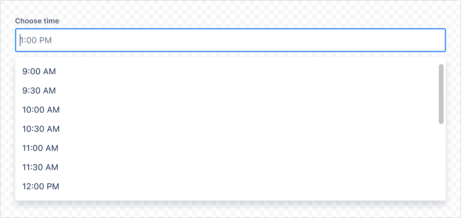
1
2import { Label, TimePicker } from "@forge/react";

const TimePickerDefaultExample = () => {
  return (
    <Label labelFor="default-time-picker-example">Choose time</Label>
    <TimePicker
    selectProps={{
        inputId: "default-time-picker-example",
    }}
    />
  );
};
Form
When using the time picker with the form component, include a label and helper text. For more information, see the form component.
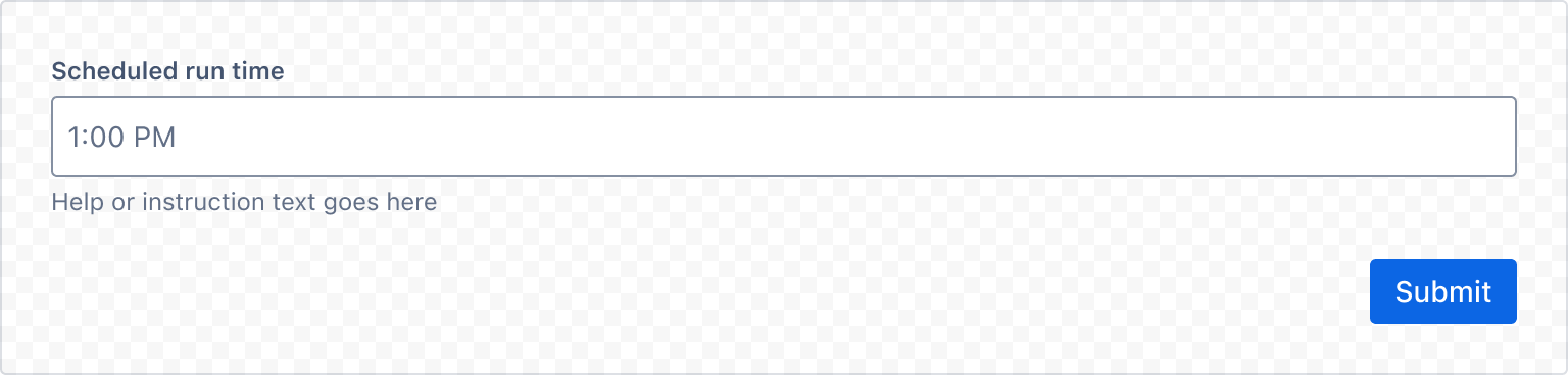
1
2import {
  Button,
  useForm,
  Form,
  FormFooter,
  Label,
  RequiredAsterisk,
} from "@forge/react";

const TimePickerFormExample = () => {
  const { handleSubmit, register, getFieldId } = useForm();
  return (
    <>
      <Form onSubmit={handleSubmit(console.log)}>
        <Label labelFor={getFieldId("time-picker")}>
          Scheduled run time <RequiredAsterisk />
        </Label>
        <TimePicker
          {...register("time-picker")}
          selectProps={{
            inputId: getFieldId("time-picker"),
          }}
        />
        <FormFooter>
          <Button appearance="primary" type="submit">
            Submit
          </Button>
        </FormFooter>
      </Form>
    </>
  );
};
Field label and message
Always use a label component for each field and associate the label to the field properly. Use the HelperMessage component for any optional field-related message.
Required field label
For required fields, always add RequiredAsterisk component next to the label.
Validation
This is how time picker behaves within forms.
Validation displays an error message related to the restrictions of the time picker.
When a user selects the time picker area, the focus color changes to blue. When validating time pickers in real-time, message icons switch based on the message type.
For example, helper text becomes an error message when the input content doesn't meet the criteria. Error and warning messages disappear when the criteria is met.
Keep helper text as short as possible. For complex information, provide a link to more information in a new browser tab. Use the messaging guidelines for more help.

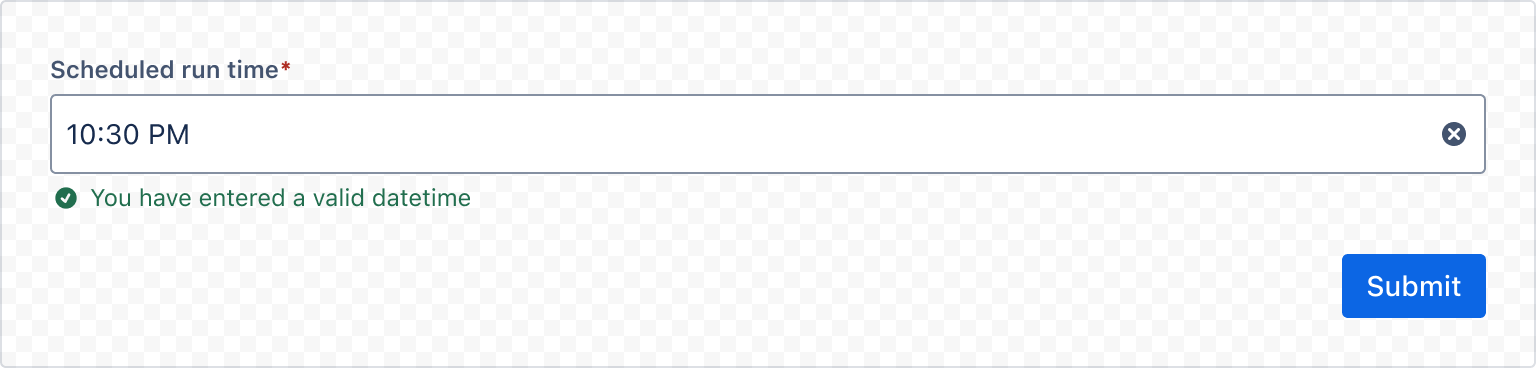
1
2import {
    TimePicker
    Label,
    useForm,
    Form,
    FormFooter,
    Button,
    ErrorMessage,
    HelperMessage,
    ValidMessage,
    RequiredAsterisk
} from "forge/react";

const TimePickerFormValidationExample = () => {
  const { handleSubmit, register, getFieldId, formState } = useForm();
  const { errors, touchedFields } = formState;

  return (
    <Form onSubmit={handleSubmit(console.log)}>
        <Label labelFor={getFieldId("time-picker")}>
            Scheduled run time <RequiredAsterisk />
        </Label>
        <TimePicker
            {...register("time-picker", { required: true })}
            selectProps={{
                inputId: getFieldId("time-picker"),
            }}
        />
        {errors["time-picker"] && (
            <ErrorMessage>This field is required</ErrorMessage>
        )}
        {!touchedFields["time-picker"] && !errors["time-picker"] && (
            <HelperMessage>Help or instruction text goes here</HelperMessage>
        )}
        {touchedFields["time-picker"] && !errors["time-picker"] && (
            <ValidMessage>You have entered a valid datetime</ValidMessage>
        )}
        <FormFooter>
            <Button appearance="primary" type="submit">
                Submit
            </Button>
        </FormFooter>
    </Form>
  );
};
Internationalization
Locale
Use locale to display times in a format which is appropriate to users.
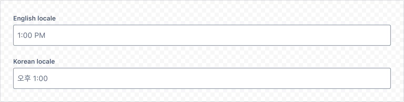
1
2import { TimePicker, Label } from "@forge/react";

export const TimePickerLocaleExample = () => {
  return (
    <>
      <Label labelFor="timepicker-locale-en">English locale</Label>
      <TimePicker
        locale="en-US"
        selectProps={{
          inputId: "timepicker-locale-en",
        }}
      />
      <Label labelFor="timepicker-locale-ko">Korean locale</Label>
      <TimePicker
        locale="ko-KR"
        selectProps={{
          inputId: "timepicker-locale-ko",
        }}
      />
    </>
  );
};
Time formats
TimePicker supports customizing the format of times. Formats are given as strings and use the syntax specified at Modern JavaScript Date Utility Library.
- `timeFormat` determined how times are formatted.
Where possible use locale for time formatting, instead of a custom format.
Time formats should be informed by the user’s locale and the use case.
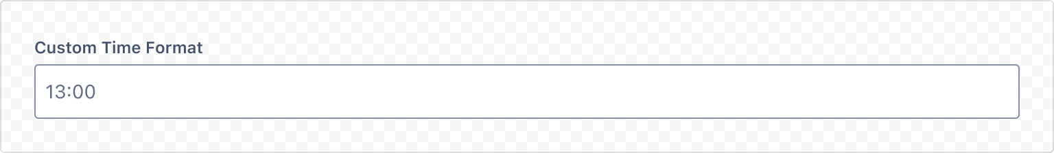
1
2import { TimePicker, Label } from "@forge/react";

const TimePickerCustomTimeFormat = () => {
  return (
    <Label labelFor="timepicker-custom-format">Custom Time Format</Label>
    <TimePicker
      timeFormat="HH:mm"
      placeholder="13:30"
      selectProps={{
        inputId: "timepicker-custom-format",
      }}
    />
  )
}
Time editable
This allows the time field to be edited via keyboard prompts.
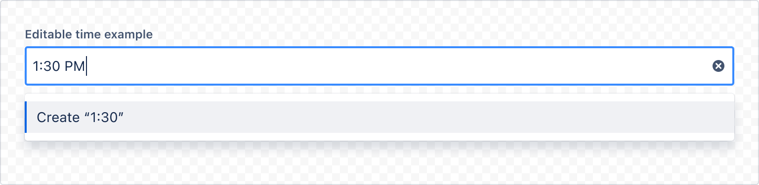
1
2import { TimePicker, Label } from "@forge/react";

const TimePickerEditableExample = () => (
  <>
    <Label labelFor="timepicker-editable-time">Editable time example</Label>
    <TimePicker
      timeIsEditable
      selectProps={{
        inputId: "timepicker-editable-time",
      }}
    />
  </>
);
Rate this page: