- ADF renderer
- Atlassian icon (Preview)
- Atlassian tile (Preview)
- Badge
- Bleed (Preview)
- Box
- Breadcrumbs (Preview)
- Button
- Button group
- Calendar
- Chart - Bar
- Chart - Donut
- Chart - Horizontal bar
- Chart - Horizontal stack bar
- Chart - Line
- Chart - Pie
- Chart - Stack bar
- Checkbox
- Checkbox group
- Code
- Code block
- Comment
- Comment editor
- Chromeless editor
- Date picker
- Dynamic table
- Empty state
- File card (Preview)
- File picker (Preview)
- Form
- Frame
- Heading
- Icon
- Image
- Inline
- Inline edit
- Link
- List
- Lozenge
- Modal
- Popup
- Pagination (Preview)
- Pressable
- Progress bar
- Progress tracker
- Radio
- Radio group
- Range
- Section message
- Select
- Spinner
- Stack
- Tabs
- Tag
- Tag group
- Text
- Text area
- Text field
- Time picker
- Tile (Preview)
- Toggle
- Tooltip
- User
- User group
- User picker
- XCSS
Last updated Jan 29, 2024
User picker
To add the UserPicker component to your app:
1
2import { UserPicker } from "@forge/react";
Description
A dropdown field that allows users to search and select users from a list.
Props
| Name | Type | Required | Available in macro config | Description |
|---|---|---|---|---|
isMulti | boolean | No | Yes | Whether the user can select multiple users from the list. Defaults to false. |
isRequired | boolean | No | Yes | Indicates to the user whether or not a value is required in this field to submit the form. If a field is required, an asterisk appears at the end of that field’s label. |
label | string | Yes | No | The label text to display. |
name | string | Yes | Yes | The key to which the input value is assigned in the returned form object. If isMulti is
true, the submitted value is an array of strings; otherwise, it is a string. |
defaultValue | string | No | Yes | The initial user to display. The value should be an Atlassian account ID. |
description | string | No | Yes | The text description of the user picker field. |
placeholder | string | No | Yes | The placeholder helper text. |
onChange |
| No | No | An event handler that can be asynchronous. Allows you to read values from the component without having to submit as part of a Form. |
Examples
Default
A field for selecting a user.
See the example on how the UserPicker component can be used in a Form: Form with all fields.
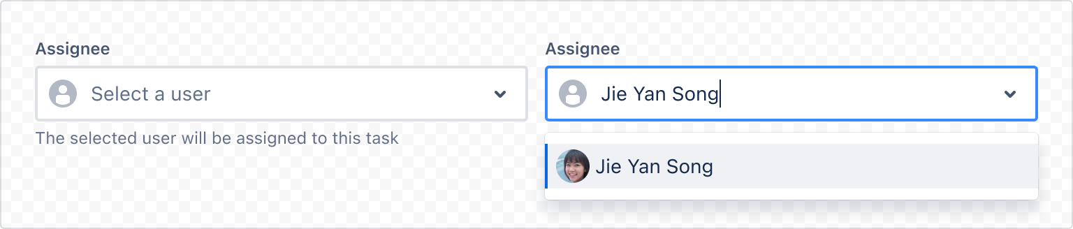
1
2const App = () => {
  return (
    <UserPicker
      label="Assignee"
      placeholder="Select a user"
      name="user"
      description="The selected user will be assigned to this task"
      onChange={(user) => console.log(user)}
    />
  );
};
The returned object from onChange contains the Atlassian account ID and various other information of the selected user.
1
2{
    "id": "1a2345bc6789012d3e45f67",
    "type": "user",
    "avatarUrl": "...",
}
Multi
Multiple users can be selected when the isMulti prop is applied.
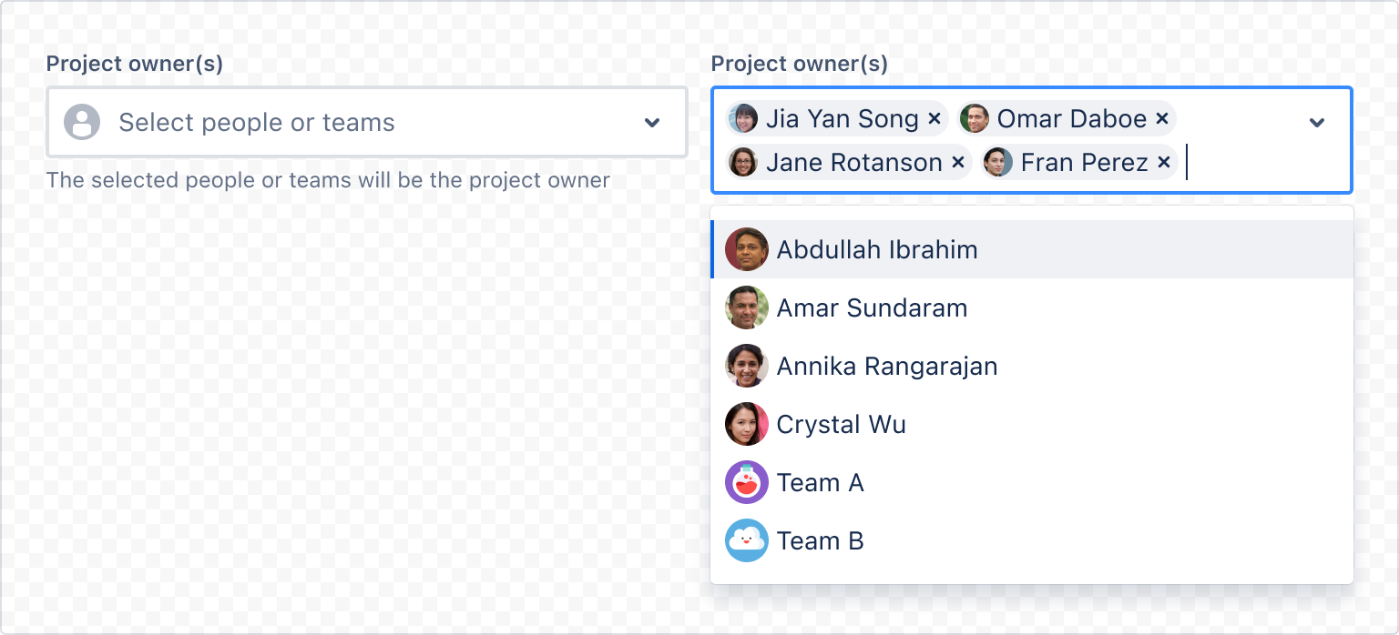
1
2const App = () => {
  return (
    <UserPicker
      isMulti
      label="Project owner(s)"
      placeholder="Select people or teams"
      name="project-owners"
      description="The selected people or teams will be the project owner"
      onChange={(users) => console.log(users)}
    />
  );
};
Rate this page: