- ADF renderer
- Atlassian icon (Preview)
- Atlassian tile (Preview)
- Badge
- Box
- Button
- Button group
- Calendar
- Chart - Bar
- Chart - Donut
- Chart - Horizontal bar
- Chart - Horizontal stack bar
- Chart - Line
- Chart - Pie
- Chart - Stack bar
- Checkbox
- Checkbox group
- Code
- Code block
- Comment
- Comment editor
- Chromeless editor
- Date picker
- Dynamic table
- Empty state
- File card (EAP)
- File picker (EAP)
- Form
- Frame
- Heading
- Icon
- Image
- Inline
- Inline edit
- Link
- List
- Lozenge
- Modal
- Popup
- Pressable
- Progress bar
- Progress tracker
- Radio
- Radio group
- Range
- Section message
- Select
- Spinner
- Stack
- Tabs
- Tag
- Tag group
- Text
- Text area
- Text field
- Time picker
- Tile (Preview)
- Toggle
- Tooltip
- User
- User group
- User picker
- XCSS
Atlassian tile (Preview)
This section describes a Forge preview feature. Preview features are deemed stable; however, they remain under active development and may be subject to shorter deprecation windows. Preview features are suitable for early adopters in production environments.
We release preview features so partners and developers can study, test, and integrate them prior to General Availability (GA). For more information, see Forge release phases: EAP, Preview, and GA.
To add the AtlassianTile component to your app:
1
2import { AtlassianTile } from "@forge/react";
Description
The AtlassianTile component displays tiles for Atlassian object types, such as stories, tasks, epics, and blogs.
Compared to the standard Tile component, AtlassianTile has fixed color, size, and styling options. This keeps Atlassian object types consistent across the platform and aligned with Atlassian Design System (ADS) specifications. Because AtlassianTile stays in sync with ADS, any changes to tile styling in the design system are reflected in your app automatically.
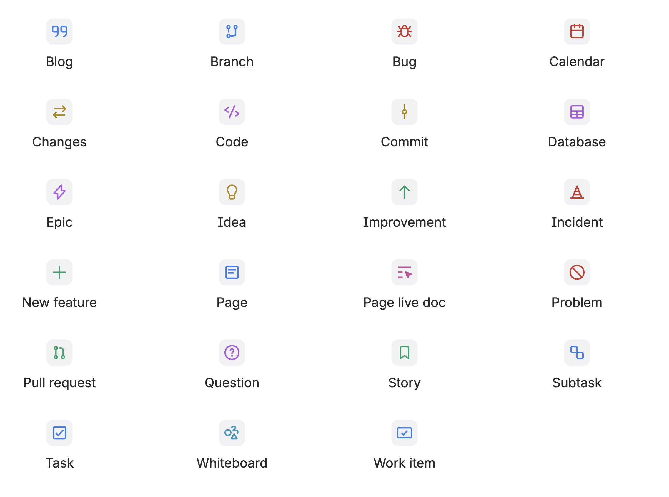
Atlassian tile types
The following image shows some of the available Atlassian tile types. For the full list of Atlassian tile types and usage guidelines, see the Atlassian Design System object tile component.
Props
| Name | Type | Required | Description |
|---|---|---|---|
glyph | AtlassianTileType | Yes | The Atlassian tile type to display. Color is applied automatically based on the type. |
label | string | No | The label for the Atlassian tile. If the icon is decorative, use an empty string. Defaults to a human-readable version of the icon type (for example, "Story" for a story icon). |
size | 'xsmall' | 'small' | 'medium' | 'large' | 'xlarge' | No |
The size of the tile. Defaults to
|
isBold | boolean | No | Whether the Atlassian tile should be bold in appearance. Defaults to false. |
Examples
Default
The default appearance of an Atlassian tile with the default size (medium).
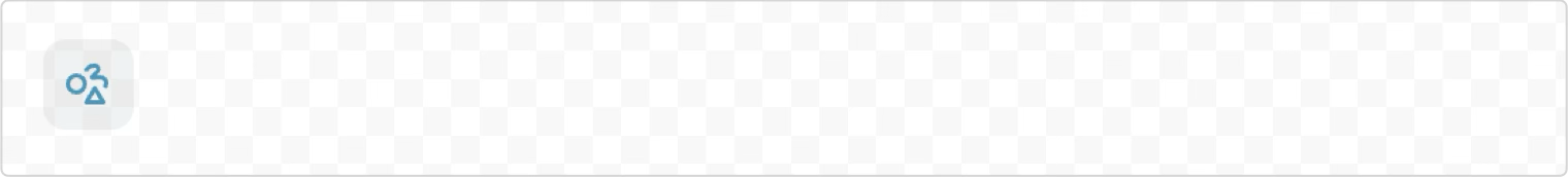
1
2const AtlassianTileDefault = () => {
  return <AtlassianTile glyph="whiteboard" label="whiteboard Atlassian tile" />;
};
Size
Atlassian tiles can be displayed in five sizes: xsmall (20px), small (24px), medium (32px), large (40px), and xlarge (48px). The medium size is the default.
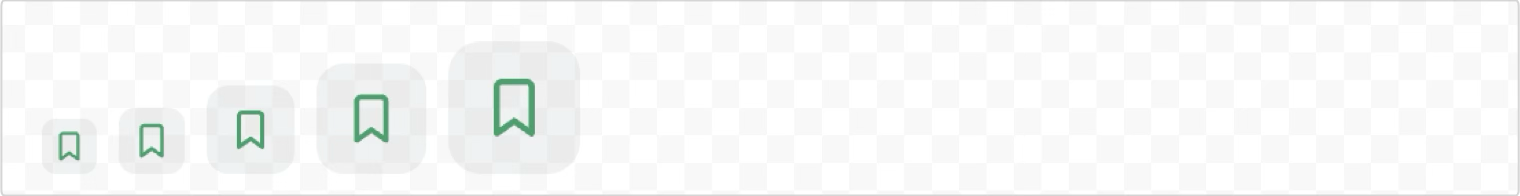
1
2const AtlassianTileSize = () => {
  return (
    <>
      <AtlassianTile glyph="story" size="xsmall" label="Extra small story tile (20px)" />
      <AtlassianTile glyph="story" size="small" label="Small story tile (24px)" />
      <AtlassianTile glyph="story" size="medium" label="Medium story tile (32px)" />
      <AtlassianTile glyph="story" size="large" label="Large story tile (40px)" />
      <AtlassianTile glyph="story" size="xlarge" label="Extra large story tile (48px)" />
    </>
  );
};
Bold appearance
Atlassian tiles can be displayed with a bold appearance using the isBold prop. When isBold is true, the tile uses a darker icon color and a bright background color.
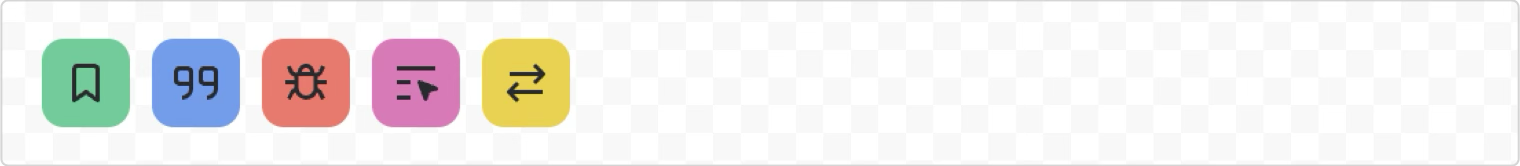
1
2const AtlassianTileBold = () => {
  return (
    <>
      <AtlassianTile glyph="story" label="story tile" isBold={true} />
      <AtlassianTile glyph="blog" label="blog tile" isBold={true} />
      <AtlassianTile glyph="bug" label="bug tile" isBold={true} />
      <AtlassianTile glyph="page-live-doc" label="page live doc tile" isBold={true} />
      <AtlassianTile glyph="changes" label="changes tile" isBold={true} />
    </>
  );
};
Atlassian icons in tiles
Use AtlassianTile when you need Atlassian icons in tiles. The Atlassian icon component is not supported with the Tile component. This keeps icon and tile styling consistent with the Atlassian Design System.
For tiles with custom or non-Atlassian icons, use the Tile component with the standard Icon component.
See the Atlassian icon component for Atlassian icons without tiles.
Accessibility considerations
When using the AtlassianTile component, we recommend keeping the following accessibility considerations in mind:
Provide meaningful labels
Always provide a meaningful label prop that describes the content type the Atlassian tile represents. This ensures screen readers can properly announce the tile to users. If the tile is purely decorative and doesn't convey meaningful information, use an empty string for the label.
Rate this page: