- ADF renderer
- Atlassian icon (Preview)
- Atlassian tile (Preview)
- Badge
- Box
- Button
- Button group
- Calendar
- Chart - Bar
- Chart - Donut
- Chart - Horizontal bar
- Chart - Horizontal stack bar
- Chart - Line
- Chart - Pie
- Chart - Stack bar
- Checkbox
- Checkbox group
- Code
- Code block
- Comment
- Comment editor
- Chromeless editor
- Date picker
- Dynamic table
- Empty state
- File card (EAP)
- File picker (EAP)
- Form
- Frame
- Heading
- Icon
- Image
- Inline
- Inline edit
- Link
- List
- Lozenge
- Modal
- Popup
- Pressable
- Progress bar
- Progress tracker
- Radio
- Radio group
- Range
- Section message
- Select
- Spinner
- Stack
- Tabs
- Tag
- Tag group
- Text
- Text area
- Text field
- Time picker
- Tile (Preview)
- Toggle
- Tooltip
- User
- User group
- User picker
- XCSS
Tile (Preview)
This section describes a Forge preview feature. Preview features are deemed stable; however, they remain under active development and may be subject to shorter deprecation windows. Preview features are suitable for early adopters in production environments.
We release preview features so partners and developers can study, test, and integrate them prior to General Availability (GA). For more information, see Forge release phases: EAP, Preview, and GA.
To add the Tile component to your app:
1
2import { Tile } from "@forge/react";
Description
A tile is a rounded square container for displaying assets like icons, emojis, or images in a consistent, styled way.
You can display an icon in a tile by using the Tile component with the Icon component.
Note that Atlassian icons cannot be used with the standard Tile component. If you want an Atlassian icon in a tile, use the Atlassian tile component instead. This keeps styling consistent for Atlassian icons and tiles.
Props
| Name | Type | Required | Description |
|---|---|---|---|
label | string | Yes | The label for the tile. If the tile is decorative, this can be set to an empty string. |
size | 'xxsmall', 'xsmall', 'small', 'medium', 'large' or 'xlarge' | No |
The size of the tile. Defaults to
|
backgroundColor | string | No |
The background color of the tile. Accepts design tokens representing background color (e.g., Allowed values include any design token with the prefix |
hasBorder | boolean | No | Whether the tile has a border. Defaults to false. |
isInset | boolean | No | Whether the tile applies internal inset/padding. Used to provide appropriate spacing for assets when needed. Defaults to true. |
Examples
Default
The default tile has a medium size, neutral background, and inset enabled – this is the default empty state.
1
2import React from "react";
import { Tile } from "@forge/react";

export const App = () => <Tile label="" />; //The empty label indicates this is a decorative tile
Size
Tiles come in six different sizes. The size property controls both the width and height of the tile.
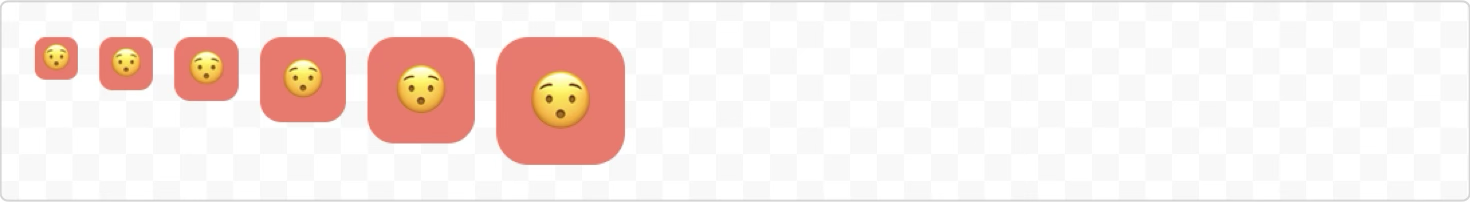
1
2import React from "react";
import { Tile, Inline } from "@forge/react";

export const App = () => (
  <Inline space="space.100">
    <Tile label="Surprised face" size="xxsmall" backgroundColor="color.background.accent.red.subtle">😯</Tile>
    <Tile label="Surprised face" size="xsmall" backgroundColor="color.background.accent.red.subtle">😯</Tile>
    <Tile label="Surprised face" size="small" backgroundColor="color.background.accent.red.subtle">😯</Tile>
    <Tile label="Surprised face" size="medium" backgroundColor="color.background.accent.red.subtle">😯</Tile>
    <Tile label="Surprised face" size="large" backgroundColor="color.background.accent.red.subtle">😯</Tile>
    <Tile label="Surprised face" size="xlarge" backgroundColor="color.background.accent.red.subtle">😯</Tile>
  </Inline>
);
Background color
Tiles support a variety of background colors using the backgroundColor prop, which can be set to design tokens. This defaults to color.background.neutral.
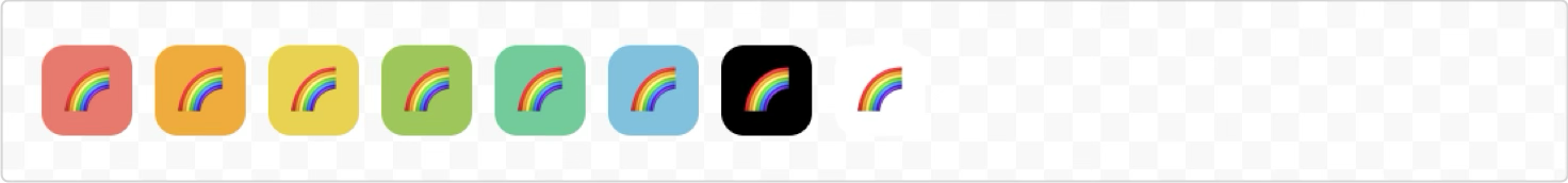
1
2import React from "react";
import { Tile, Inline } from "@forge/react";

export const App = () => (
  <Inline space="space.100">
    <Tile label="Rainbow" backgroundColor="color.background.accent.red.subtle">🌈</Tile>
    <Tile label="Rainbow" backgroundColor="color.background.accent.orange.subtle">🌈</Tile>
    <Tile label="Rainbow" backgroundColor="color.background.accent.yellow.subtle">🌈</Tile>
    <Tile label="Rainbow" backgroundColor="color.background.accent.lime.subtle">🌈</Tile>
    <Tile label="Rainbow" backgroundColor="color.background.accent.green.subtle">🌈</Tile>
    <Tile label="Rainbow" backgroundColor="color.background.accent.teal.subtle">🌈</Tile>
    <Tile label="Rainbow" backgroundColor="black">🌈</Tile>
    <Tile label="Rainbow" backgroundColor="white">🌈</Tile>
  </Inline>
);
Border and inset
You can add a border to a tile and control whether it has internal padding (inset). Disabling inset can be used for supplying assets with backgrounds, such as third-party logos. Inset is enabled by default to provide appropriate spacing for assets.
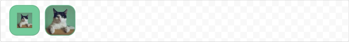
1
2import React from "react";
import { Tile, Image, Inline } from "@forge/react";
import catAsset from './catAsset.png'

export const App = () => (
  <Inline space="space.100">
    <Tile label="Cat" hasBorder size="xlarge" backgroundColor="color.background.accent.green.subtle">
      <Image src={catAsset} alt="cat" />
    </Tile>
    <Tile label="Cat" isInset={false} hasBorder size="xlarge" backgroundColor="color.background.accent.green.subtle">
      <Image src={catAsset} alt="cat" />
    </Tile>
  </Inline>
);
Icons in tiles
You can display an icon in a tile using the Icon and Tile components.
Place the Icon component as a child of the Tile component so the icon renders inside the tile.
1
2import React from "react";
import { Icon, Tile, Inline } from "@forge/react";

export const App = () => (
  <Inline space="space.100">
    <Tile label="attachment" backgroundColor="white" hasBorder>
      <Icon glyph="attachment" label="attachment" color='color.icon.accent.blue'/>
    </Tile>
    <Tile label="attachment" backgroundColor="color.background.accent.purple.subtle">
      <Icon glyph="attachment" label="attachment" />
    </Tile>
  </Inline>
);
If you're looking to use Atlassian icons in tiles, use the AtlassianTile component instead, as it is designed to work specifically for Atlassian icons.
Accessibility considerations
The label prop is required and serves as the accessible name for the tile. This helps users who use:
- Screen readers
- Braille displays
- Text-to-speech technology
Decorative tiles
If a tile is purely decorative and doesn't convey meaning, set the label prop to an empty string (""). This marks the tile as presentation-only and prevents screen readers from announcing it.
Non-decorative tiles
For tiles that convey meaning or add context, provide a clear, descriptive label that explains what the tile represents. Keep labels concise and meaningful:
- Describe what the tile represents, not just what it contains.
- Keep labels to no more than ~100 characters for a streamlined experience.
- Avoid using "tile of..." or "image of..." as assistive technology will provide context when encountering the tile element.
Rate this page: