- ADF renderer
- Atlassian icon (Preview)
- Atlassian tile (Preview)
- Badge
- Box
- Button
- Button group
- Calendar
- Chart - Bar
- Chart - Donut
- Chart - Horizontal bar
- Chart - Horizontal stack bar
- Chart - Line
- Chart - Pie
- Chart - Stack bar
- Checkbox
- Checkbox group
- Code
- Code block
- Comment
- Comment editor
- Chromeless editor
- Date picker
- Dynamic table
- Empty state
- File card (EAP)
- File picker (EAP)
- Form
- Frame
- Heading
- Icon
- Image
- Inline
- Inline edit
- Link
- List
- Lozenge
- Modal
- Popup
- Pressable
- Progress bar
- Progress tracker
- Radio
- Radio group
- Range
- Section message
- Select
- Spinner
- Stack
- Tabs
- Tag
- Tag group
- Text
- Text area
- Text field
- Time picker
- Tile (Preview)
- Toggle
- Tooltip
- User
- User group
- User picker
- XCSS
Modal
To add the Modal, ModalBody, ModalTransition, ModalTitle, ModalFooter, ModalHeader,
components to your app:
1
2import {
  Modal,
  ModalBody,
  ModalTransition,
  ModalTitle,
  ModalFooter,
  ModalHeader,
} from "@forge/react";
Description
A modal dialog displays content that requires user interaction, in a layer above the page.
Props
| Name | Type | Required | Description |
|---|---|---|---|
height | number | No | Height of the modal dialog. When unset the modal dialog will grow to fill the viewport and then start overflowing its contents. |
width | "small" | "medium" | "large" | "x-large" | "fullscreen" | number | No | Width of the modal dialog. The recommended way to specify modal width is using named size options. |
onClose | (e: KeyboardOrMouseEvent) => void | No | Callback function called when the modal dialog is requesting to be closed. |
shouldScrollInViewport | boolean | No | Will set the scroll boundary to the viewport. If set to false, the scroll boundary is set to the modal dialog body. |
label | string | No | The label of the modal dialog that is announced to users of assistive technology. This should only be used if there is no modal title being associated to your modal. |
title | string or i18n object | No |
The title of the modal. When provided, a modal header will be rendered with the title and a close button. The |
icon | string | No | The URL of the icon that displays next to the title. When provided, a modal header will be rendered with the icon, title and a close button. |
fullscreen viewport sizing is now available for Confluence and Jira as part of our Early Access Program (EAP). This allows your UI Kit Modal to fill the entire viewport. You can also provide a title and an icon to display in the header. To start testing, sign up here. To use these features, run npm install --save @forge/react@11.11.0-next.1 in your terminal.
By signing up for this Early Access Program (“EAP”), you acknowledge that use of the Forge Full Page Modals is governed by the Atlassian Developer Terms. The Forge Full Page Modals are considered “Early Access Materials”, as set forth in Section 10 of the Atlassian Developer Terms and is subject to applicable terms, conditions, and disclaimers.
For more details, see Forge EAP, Preview, and GA.
Body
| Name | Type | Required | Description |
|---|---|---|---|
children | ForgeElement | Yes | Children of modal dialog body. |
Footer
| Name | Type | Required | Description |
|---|---|---|---|
children | ForgeElement | No | Children of modal dialog footer. |
Header
| Name | Type | Required | Description |
|---|---|---|---|
children | ForgeElement | No | Children of modal dialog header. |
Title
| Name | Type | Required | Description | |
|---|---|---|---|---|
appearance | "warning" | "danger" | No | Appearance of the modal, which changes the color of the primary action and adds an icon to the title. | |
isMultiline | boolean | No | When set to true, this will allow the title to span multiple lines. Defaults to true. | |
children | ForgeElement | No | Children of modal dialog title. |
Transition
| Name | Type | Required | Description |
|---|---|---|---|
children | ForgeElement | No | Children can be any Forge Element. |
Examples
Default
The default form of a modal dialog.
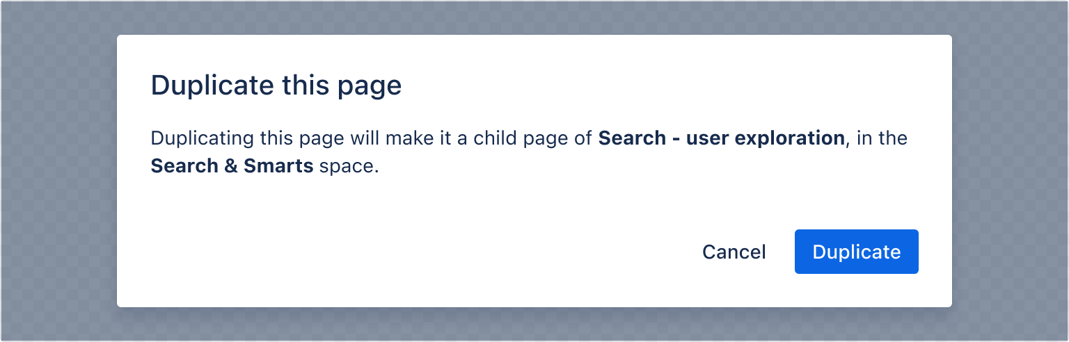
1
2const ModalDefaultExample = () => {
  const [isOpen, setIsOpen] = useState(false);
  const openModal = () => setIsOpen(true);
  const closeModal = () => setIsOpen(false);

  return (
    <>
      <Button appearance="primary" onClick={openModal}>
        Open modal
      </Button>

      <ModalTransition>
        {isOpen && (
          <Modal onClose={closeModal}>
            <ModalHeader>
              <ModalTitle>Duplicate this page</ModalTitle>
            </ModalHeader>
            <ModalBody>
              <Text>
                Duplicating this page will make it a child page of{" "}
                <Strong>Search - user exploration</Strong>, in the{" "}
                <Strong>Search & Smarts</Strong> space.
              </Text>
            </ModalBody>
            <ModalFooter>
              <Button appearance="subtle" onClick={closeModal}>
                Cancel
              </Button>
              <Button appearance="primary" onClick={closeModal}>
                Duplicate
              </Button>
            </ModalFooter>
          </Modal>
        )}
      </ModalTransition>
    </>
  );
};
Appearance
Warning appearance
A modal dialog is available in two other variations. The appearance needs to be set on both the modal title and the primary button. Warning modals appear in anticipation of a significant change. If the warning comes before an action, clearly communicate what will happen if the user proceeds, also provide an alternative or an opt-out where possible.
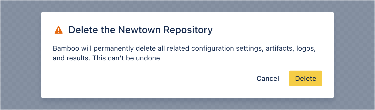
1
2const ModalWarningAppearanceExample = () => {
  const [isOpen, setIsOpen] = useState(false);
  const openModal = () => setIsOpen(true);
  const closeModal = () => setIsOpen(false);

  return (
    <>
      <Button appearance="primary" onClick={openModal}>
        Open warning modal
      </Button>

      <ModalTransition>
        {isOpen && (
          <Modal onClose={closeModal}>
            <ModalHeader>
              <ModalTitle appearance="warning">
                Delete the Newtown Repository
              </ModalTitle>
            </ModalHeader>
            <ModalBody>
              Bamboo will permanently delete all related configuration settings,
              artifacts, logos, and results. This can't be undone.
            </ModalBody>
            <ModalFooter>
              <Button appearance="subtle" onClick={closeModal}>
                Cancel
              </Button>
              <Button appearance="warning" onClick={closeModal}>
                Delete
              </Button>
            </ModalFooter>
          </Modal>
        )}
      </ModalTransition>
    </>
  );
};
Danger appearance
Use danger modals to inform people that something potentially destructive will happen if they continue. Explain the problem and provide a next step or an alternative.
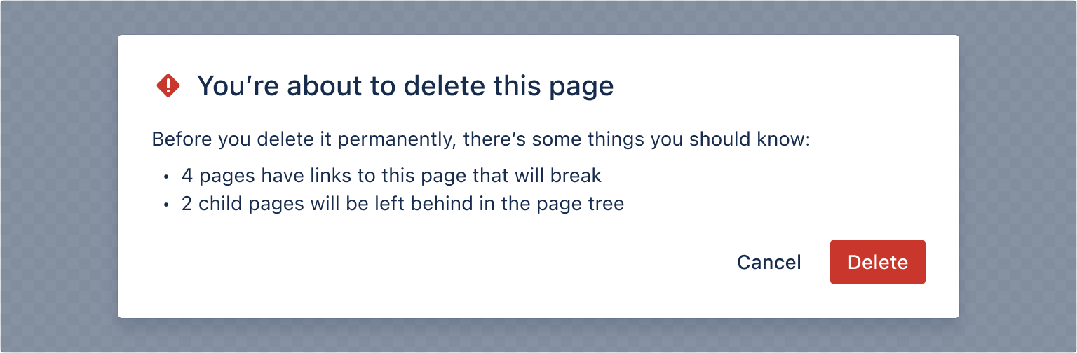
1
2const ModalDangerAppearanceExample = () => {
  const [isOpen, setIsOpen] = useState(false);
  const openModal = () => setIsOpen(true);
  const closeModal = () => setIsOpen(false);

  return (
    <>
      <Button appearance="primary" onClick={openModal}>
        Open modal
      </Button>

      <ModalTransition>
        {isOpen && (
          <Modal onClose={closeModal}>
            <ModalHeader>
              <ModalTitle appearance="danger">
                You're about to delete this page
              </ModalTitle>
            </ModalHeader>
            <ModalBody>
              <Text>
                Before you delete it permanently, there's some things you should
                know:
              </Text>
              <Text>- 2 child pages will be left behind in the page tree</Text>
              <Text>- 2 child pages will be left behind in the page tree</Text>
            </ModalBody>
            <ModalFooter>
              <Button appearance="subtle" onClick={closeModal}>
                Cancel
              </Button>
              <Button appearance="danger" onClick={closeModal}>
                Delete
              </Button>
            </ModalFooter>
          </Modal>
        )}
      </ModalTransition>
    </>
  );
};
Width
There are multiple ways to specify the width of a modal. We recommend using named size options to specify modal width.
- The named size options are
small,medium,large, orx-large. - If you provide a number instead, the width is set to that number of pixels.
- If you provide a string including pixels or a percentage, the width will be directly applied as a style.
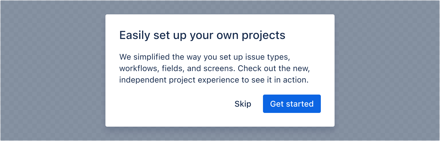
1
2const ModalWidthExample = () => {
  const [isOpen, setIsOpen] = useState(false);

  return (
    <>
      <Button appearance="primary" onClick={openModal}>
        Open modal
      </Button>

      <ModalTransition>
        {isOpen && (
          <Modal onClose={closeModal} width="small">
            <ModalHeader>
              <ModalTitle>Easily set up your own projects</ModalTitle>
            </ModalHeader>
            <ModalBody>
              We simplified the way you set up issue types, workflows, fields,
              and screens. Check out the new, independent project experience to
              see it in action.
            </ModalBody>
            <ModalFooter>
              <Button appearance="subtle" onClick={closeModal}>
                Skip
              </Button>
              <Button appearance="primary" onClick={closeModal}>
                Get started
              </Button>
            </ModalFooter>
          </Modal>
        )}
      </ModalTransition>
    </>
  );
};
Scrolling behavior
While you can set the width of the modal, the content determines the height of the modal. Once it reaches a certain threshold, the body content will scroll while the header and footer remain fixed until the user reaches the bottom of the modal dialog.
You can configure the scroll behavior of modals so that scrolling happens inside the modal body instead of the viewport by setting the shouldScrollInViewport prop to false.
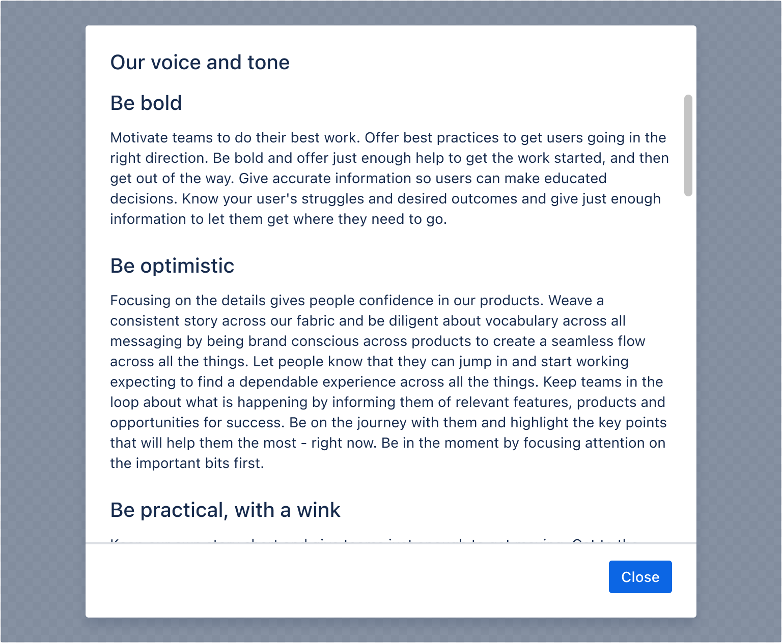
1
2const ModalScrollingBehaviourExample = () => {
  const [isOpen, setIsOpen] = useState(false);

  return (
    <>
      <Button appearance="primary" onClick={openModal}>
        Open modal
      </Button>

      <ModalTransition>
        {isOpen && (
          <Modal
            onClose={closeModal}
            shouldScrollInViewport={false}
            height={600}
          >
            <ModalHeader>
              <ModalTitle>Our voice and tone</ModalTitle>
            </ModalHeader>
            <ModalBody>
              <Heading as="h3">Be bold</Heading>
              <Text>
                Motivate teams to do their best work. Offer best practices to
                get users going in the right direction. Be bold and offer just
                enough help to get the work started, and then get out of the
                way. Give accurate information so users can make educated
                decisions. Know your user's struggles and desired outcomes and
                give just enough information to let them get where they need to
                go.
              </Text>

              <Heading as="h3">Be optimistic</Heading>

              <Text>
                Focusing on the details gives people confidence in our products.
                Weave a consistent story across our fabric and be diligent about
                vocabulary across all messaging by being brand conscious across
                products to create a seamless flow across all the things. Let
                people know that they can jump in and start working expecting to
                find a dependable experience across all the things. Keep teams
                in the loop about what is happening by informing them of
                relevant features, products and opportunities for success. Be on
                the journey with them and highlight the key points that will
                help them the most - right now. Be in the moment by focusing
                attention on the important bits first.
              </Text>

              <Heading as="h3">Be practical, with a wink</Heading>

              <Text>
                Keep our own story short and give teams just enough to get
                moving. Get to the point and be direct. Be concise - we tell the
                story of how we can help, but we do it directly and with
                purpose. Be on the lookout for opportunities and be quick to
                offer a helping hand. At the same time realize that nobody likes
                a nosy neighbor. Give the user just enough to know that
                something awesome is around the corner and then get out of the
                way. Write clear, accurate, and concise text that makes
                interfaces more usable and consistent; and builds trust. We
                strive to write text that is understandable by anyone, anywhere,
                regardless of their culture or language so that everyone feels
                they are part of the team.
              </Text>
            </ModalBody>
            <ModalFooter>
              <Button appearance="primary" onClick={closeModal}>
                Close
              </Button>
            </ModalFooter>
          </Modal>
        )}
      </ModalTransition>
    </>
  );
};
Form
These internal components can be wrapped in a form element to support having buttons of type submit in the footer.
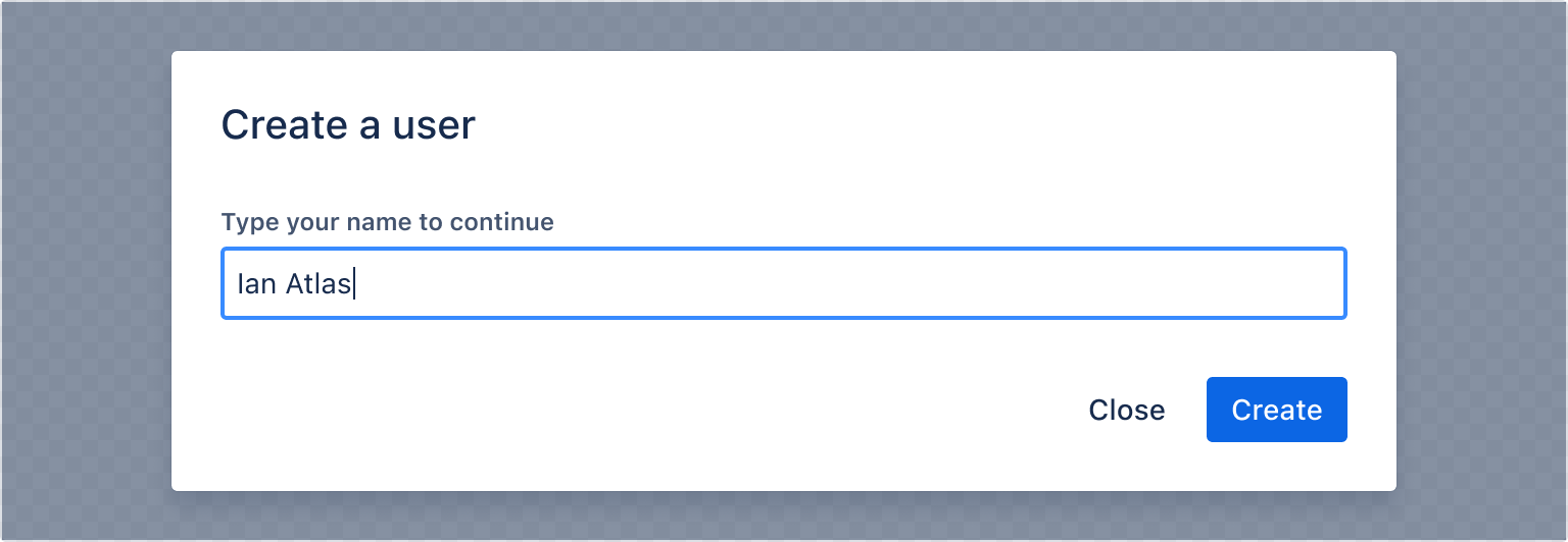
1
2import {
  Modal,
  ModalBody,
  ModalTransition,
  ModalTitle,
  ModalFooter,
  ModalHeader,
  Form,
  useForm,
  Textfield,
  Label,
  Button,
} from "@forge/react";

// `useForm` internal state should be in it's own component so that it can reset it's internal state when it unmounts via the modal closing
const FormInModal = () => {
  const { handleSubmit, getFieldId, register } = useForm();
  const onSubmit = handleSubmit((data) => console.log(data));

  return (
    <Form onSubmit={onSubmit}>
      <ModalHeader>
        <ModalTitle>Create a user</ModalTitle>
      </ModalHeader>
      <ModalBody>
        <Label labelFor={getFieldId("user")}>Type your name to continue</Label>
        <Textfield {...register("user")} />
      </ModalBody>
      <ModalFooter>
        <Button appearance="subtle" onClick={closeModal}>
          Close
        </Button>
        <Button appearance="primary" type="submit">
          Create
        </Button>
      </ModalFooter>
    </Form>
  );
};

const ModalFormExample = () => {
  const [isOpen, setIsOpen] = useState(false);

  const openModal = () => setIsOpen(true);
  const closeModal = () => setIsOpen(false);

  return (
    <>
      <Button appearance="primary" onClick={openModal}>
        Open modal
      </Button>

      <ModalTransition>
        {isOpen && (
          <Modal onClose={closeModal}>
            <FormInModal />
          </Modal>
        )}
      </ModalTransition>
    </>
  );
};
Modal header
Modal header accepts any valid Forge Element as children, so you can use modal title in conjunction with other elements in the top right.
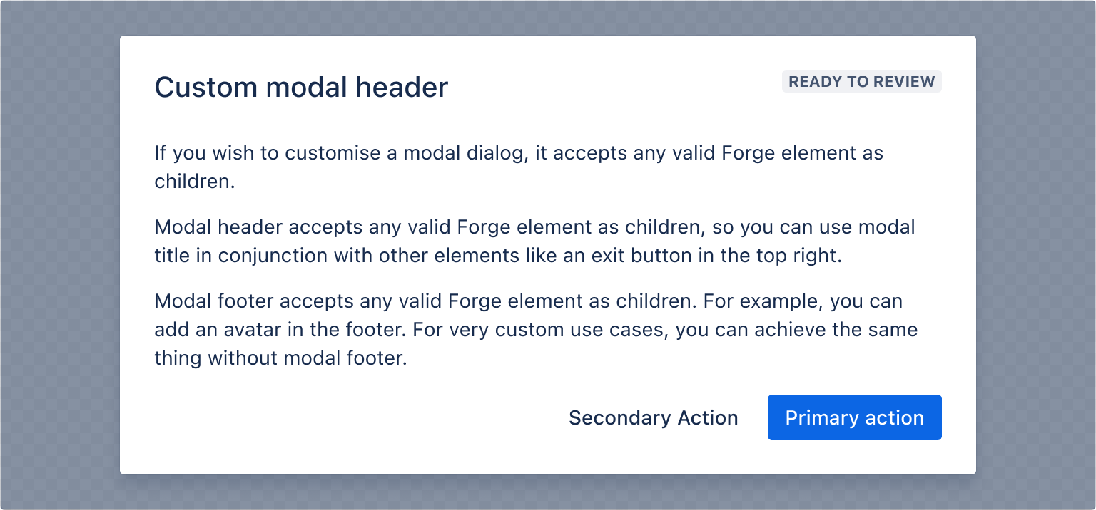
1
2import {
  Modal,
  ModalBody,
  ModalTransition,
  ModalTitle,
  ModalFooter,
  ModalHeader,
  Lozenge,
  Button,
  Text,
} from "@forge/react";

const ModalHeaderExample = () => {
  const [isOpen, setIsOpen] = useState(false);
  const openModal = () => setIsOpen(true);
  const closeModal = () => setIsOpen(false);

  return (
    <>
      <Button appearance="primary" onClick={openModal}>
        Open modal
      </Button>

      <ModalTransition>
        {isOpen && (
          <Modal onClose={closeModal}>
            <ModalHeader>
              <ModalTitle>Custom modal header</ModalTitle>
              <Lozenge>Ready to review</Lozenge>
            </ModalHeader>
            <ModalBody>
              <Text>
                If you wish to customise a modal dialog, it accepts any valid
                Forge element as children.
              </Text>

              <Text>
                Modal header accepts any valid Forge element as children, so you
                can use modal title in conjunction with other elements like an
                exit button in the top right.
              </Text>

              <Text>
                Modal footer accepts any valid Forge element as children. For
                example, you can add an avatar in the footer. For very custom
                use cases, you can achieve the same thing without modal footer.
              </Text>
            </ModalBody>
            <ModalFooter>
              <Button appearance="subtle">Secondary Action</Button>
              <Button appearance="primary" onClick={closeModal}>
                Primary Action
              </Button>
            </ModalFooter>
          </Modal>
        )}
      </ModalTransition>
    </>
  );
};
Modal footer
Modal footer accepts any valid Forge Element as children.
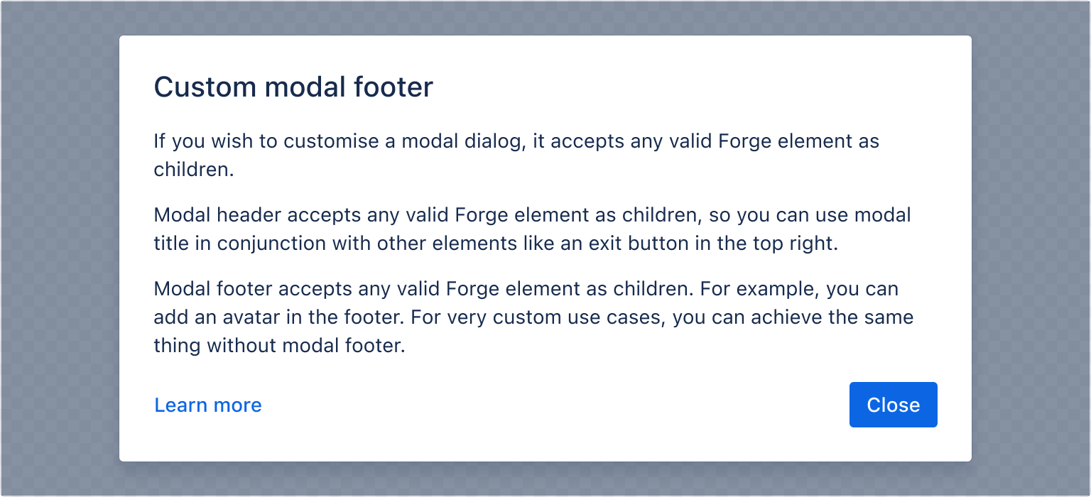
1
2import {
  Modal,
  ModalBody,
  ModalTransition,
  ModalTitle,
  ModalFooter,
  ModalHeader,
  Button,
  Text,
  Inline,
  LinkButton,
} from "@forge/react";

const ModalFooterExample = () => {
  const [isOpen, setIsOpen] = useState(false);

  const openModal = () => setIsOpen(true);
  const closeModal = () => setIsOpen(false);

  return (
    <>
      <Button appearance="primary" onClick={openModal}>
        Open modal
      </Button>

      <ModalTransition>
        {isOpen && (
          <Modal onClose={closeModal}>
            <ModalHeader>
              <ModalTitle>Custom modal footer</ModalTitle>
            </ModalHeader>
            <ModalBody>
              <Text>
                If you wish to customise a modal dialog, it accepts any valid
                Forge element as children.
              </Text>

              <Text>
                Modal header accepts any valid Forge act element as children, so
                you can use modal title in conjunction with other elements like
                an exit button in the top right.
              </Text>

              <Text>
                Modal footer accepts any valid Forge element as children. For
                example, you can add an avatar in the footer. For very custom
                use cases, you can achieve the same thing without modal footer.
              </Text>
            </ModalBody>
            <ModalFooter>
              <Box xcss={{ width: "100%" }}>
                <LinkButton appearance="link">Learn more</LinkButton>
              </Box>
              <Button appearance="primary" onClick={closeModal}>
                Close
              </Button>
            </ModalFooter>
          </Modal>
        )}
      </ModalTransition>
    </>
  );
};
Accessibility considerations
When using the Modal component, we recommend keeping the following accessibility considerations in mind:
Labeling modals
Modals must have a title or label so that users can understand what the modal is for. Consider the following to ensure you have an accessible name for your modal:
- Use the modal title component (see the modal header example).
- Use the
labelprop (this should almost never be used as there is no visual title available for sighted users).
Dismissing modals
Users can't interact with the rest of the page until the modal is closed. We've included several methods to dismiss a modal dialog to accommodate both mouse and keyboard interactions:
- Click Cancel in the footer.
- Click X in the header (if included).
- Press
Escon a keyboard. - Click anywhere outside the dialog on the backdrop.
Rate this page: