This section describes a Forge preview feature. Preview features are deemed stable; however, they remain under active development and may be subject to shorter deprecation windows. Preview features are suitable for early adopters in production environments.
We release preview features so partners and developers can study, test, and integrate them prior to General Availability (GA). For more information, see Forge release phases: EAP, Preview, and GA.
Stack
To add the Stack component to your app:
1
2import { Stack } from '@forge/react';
Description
Stack is a primitive component based on the React Native Flexbox layout model. This component provides the ability to lay out its direct children vertically.
Props
| Name | Type | Required | Description |
|---|---|---|---|
alignBlock | string | No | Aligns children vertically. Valid values are:
Defaults to start. |
alignInline | string | No | Aligns children horizontally. Valid values are:
Defaults to undefined which equates to stretch.
|
grow | string | No | Sets whether the container should grow to fill the available space. Valid values are:
Defaults to hug.
|
space | string | No | Represents the space between each child.Valid values are Space tokens:
space.0
space.025
space.050
space.075
space.100
space.150
space.200
space.250
space.300
space.400
space.500
space.600
space.800
space.1000
|
spread | string | No | Distributes its children along the vertical axis. Overrides the alignBlock property. Valid value is:
space-between |
Examples
The following example uses this ExampleBox component in their code blocks.
1
2const ExampleBox=  () => {
  return (
    <Box
      xcss={{
        backgroundColor: 'color.background.discovery',
        borderRadius: 'border.radius',
        borderStyle: 'solid',
        borderWidth: 'border.width',
        borderColor: 'color.border.discovery',
        padding: 'space.200'
      }}
    />
  )
}
Alignment
To control the alignment of items you can use the alignBlock and alignInline props which control alignment in the vertical and horizontal axis respectively.
Align block
Use to align children vertically.
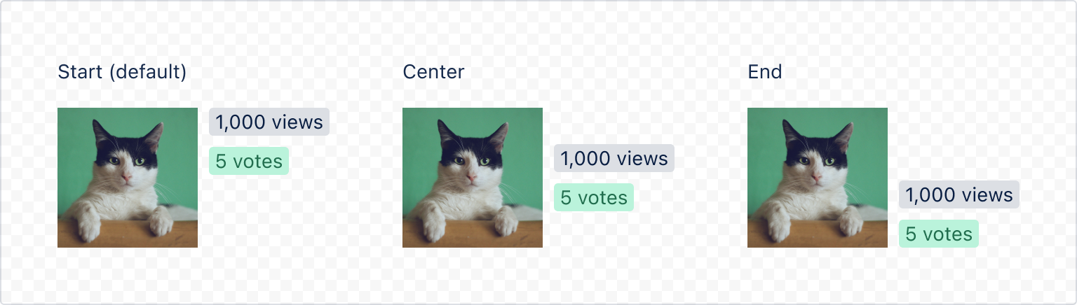
1
2import { Inline, Stack, Text, Image, Tag } from '@forge/react'

export const StackAlignBlock = () => {
 return (
   <Inline space="space.600">
     <Stack space="space.200">
       <Text>Start (default)</Text>
       <Inline grow="fill" space="space.100">
         <Image src="https://examplecat.png" size="small" />
         <Stack alignBlock="start" alignInline="start" space="space.100">
           <Tag>1,000 views</Tag>
           <Tag color="green-light">5 votes</Tag>
         </Stack>
       </Inline>
     </Stack>
     <Stack space="space.200">
       <Text>Center</Text>
       <Inline grow="fill" space="space.100">
         <Image src="https://examplecat.png" size="small" />
         <Stack alignBlock="center" alignInline="start" space="space.100">
           <Tag>1,000 views</Tag>
           <Tag color="green-light">5 votes</Tag>
         </Stack>
       </Inline>
     </Stack>
     <Stack space="space.200">
       <Text>End</Text>
       <Inline grow="fill" space="space.100">
         <Image src="https://examplecat.png" size="small" />
         <Stack alignBlock="end" alignInline="start" space="space.100">
           <Tag>1,000 views</Tag>
           <Tag color="green-light">5 votes</Tag>
         </Stack>
       </Inline>
     </Stack>
   </Inline>
 );
};
Align inline
Use to align children horizontally.
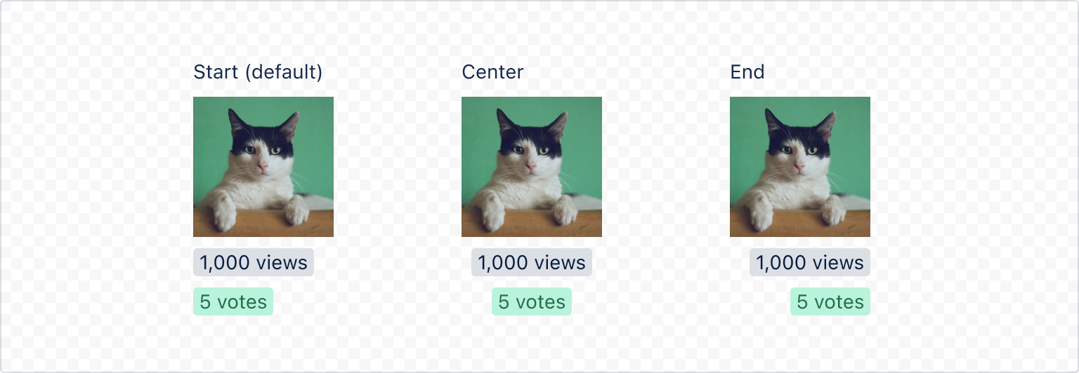
1
2import { Stack, Text, Inline, Tag, Image } from '@forge/react';

export const StackAlignInline = () => {
  return (
    <Inline space="space.600">
      <Stack space="space.100" alignInline="start">
        <Text>Start (default)</Text>
        <Image src="https://examplecat.png" size="small" />
        <Tag>1,000 views</Tag>
        <Tag color="green-light">5 votes</Tag>
      </Stack>
      <Stack space="space.100" alignInline="center">
        <Text>Center</Text>
        <Image src="https://examplecat.png" size="small" />
        <Tag>1,000 views</Tag>
        <Tag color="green-light">5 votes</Tag>
      </Stack>
      <Stack space="space.100" alignInline="end">
        <Text>End</Text>
        <Image src="https://examplecat.png" size="small" />
        <Tag>1,000 views</Tag>
        <Tag color="green-light">5 votes</Tag>
      </Stack>
    </Inline>
  );
};
Grow
Use to set whether the container should grow to fill the available space.
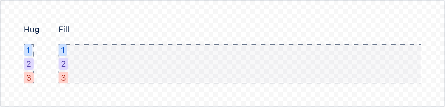
1
2import { Inline, Stack, Text, Tag } from '@forge/react';

export const StackGrow = () => {
  return (
    <Inline grow="fill" space="space.500">
      <Stack space="space.200">
        <Text>Hug</Text>
        <Stack grow="hug" space="space.050">
          <Tag color="blue-light">1</Tag>
          <Tag color="purple-light">2</Tag>
          <Tag color="red-light">3</Tag>
        </Stack>
      </Stack>
      <Stack space="space.200">
        <Text>Fill</Text>
        <Stack grow="fill" alignInline="start" space="space.050">
          <Tag color="blue-light">1</Tag>
          <Tag color="purple-light">2</Tag>
          <Tag color="red-light">3</Tag>
        </Stack>
      </Stack>
    </Inline>
  );
};
Space
Use to add a gap in between each child.
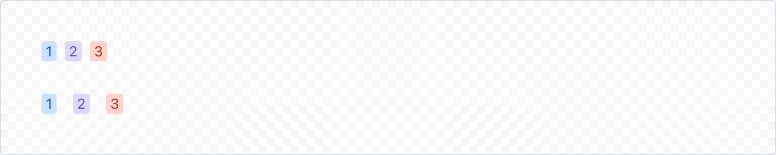
1
2import { Stack, Inline, Tag } from '@forge/react';

export const StackSpace = () => {
  return (
    <Inline space="space.400">
      <Stack space="space.100" alignInline="start">
        <Tag color="blue-light">1</Tag>
        <Tag color="purple-light">2</Tag>
        <Tag color="red-light">3</Tag>
      </Stack>
      <Stack space="space.200" alignInline="start">
        <Tag color="blue-light">1</Tag>
        <Tag color="purple-light">2</Tag>
        <Tag color="red-light">3</Tag>
      </Stack>
    </Inline>
  );
};
Spread
Use to distribute its children along the vertical axis.

1
2import { Inline, Stack, Text, Tag, Image } from '@forge/react'

export const StackAlignBlock = () => {
  return (
    <Inline space="space.600">
      <Stack space="space.200">
        <Text>With space-between</Text>
        <Inline grow="fill" space="space.100">
          <Image src="https://examplecat.png" size="medium" />
          <Stack
            alignBlock="start"
            alignInline="start"
            space="space.050"
            spread="space-between"
          >
            <Tag color="blue-light">1</Tag>
            <Tag color="purple-light">2</Tag>
            <Tag color="red-light">3</Tag>
          </Stack>
        </Inline>
      </Stack>
      <Stack space="space.200">
        <Text>Without space-between</Text>
        <Inline grow="fill" space="space.100">
          <Image src="https://examplecat.png" size="medium" />
          <Stack alignBlock="center" alignInline="start" space="space.050">
            <Tag color="blue-light">1</Tag>
            <Tag color="purple-light">2</Tag>
            <Tag color="red-light">3</Tag>
          </Stack>
        </Inline>
      </Stack>
    </Inline>
  );
};
Rate this page: