- ADF renderer
- Atlassian icon (Preview)
- Atlassian tile (Preview)
- Badge
- Box
- Button
- Button group
- Calendar
- Chart - Bar
- Chart - Donut
- Chart - Horizontal bar
- Chart - Horizontal stack bar
- Chart - Line
- Chart - Pie
- Chart - Stack bar
- Checkbox
- Checkbox group
- Code
- Code block
- Comment
- Comment editor
- Chromeless editor
- Date picker
- Dynamic table
- Empty state
- File card (EAP)
- File picker (EAP)
- Form
- Frame
- Heading
- Icon
- Image
- Inline
- Inline edit
- Link
- List
- Lozenge
- Modal
- Popup
- Pressable
- Progress bar
- Progress tracker
- Radio
- Radio group
- Range
- Section message
- Select
- Spinner
- Stack
- Tabs
- Tag
- Tag group
- Text
- Text area
- Text field
- Time picker
- Tile (Preview)
- Toggle
- Tooltip
- User
- User group
- User picker
- XCSS
Select
To add the Select component to your app:
1
2import { Select } from '@forge/react';
Description
Select allows users to make a single selection or multiple selections from a list of options.
Props
Name | Type | Required | Available in macro config | Description |
|---|---|---|---|---|
spacing | "default" | "compact" | No | No | This prop affects the height of the select control. Compact is gridSize * 4, default is gridSize * 5. |
appearance | "default" | "none" | "subtle" | No | No | This prop affects the backgroundColor and border of the Select field. subtle makes these transparent while none removes them completely. |
autoFocus | boolean
| No | No | Focus the control when it is mounted. |
defaultValue | Option | Option[] | null | No | Yes | The default value of the select. |
inputValue | string | No | No | The value of the search input. |
id | string | No | No | The id of the search input. |
isClearable | boolean | No | No | Is the select value clearable. |
isLoading | boolean | No | No | Is the select in a state of loading (async). |
isMulti | boolean | No | No | Support multiple selected options. |
isSearchable | boolean | No | No | Whether to enable search functionality. |
menuIsOpen | boolean | No | No | Whether the menu is open. |
onInputChange | (newValue: string, actionMeta: { action: 'set-value' | 'input-change' | 'input-blur' | 'menu-close', prevInputValue: string }) => void | No | No | Handle change events on the input. |
options | (Option | Group) [] | No | Yes | Array of options that populate the select menu. |
placeholder | string | No | Yes | Placeholder for the select value. |
onChange | (newValue: Option | Option[]) => void; | No | No | Handle change events on the select. |
isRequired | boolean | No | Yes | Indicates that the field is a required field. |
isInvalid | boolean | No | No | This prop indicates if the component is in an error state. |
onBlur | (e: BlurEvent) => void | No | No | Handle blur events on the control. |
onFocus | (e: FocusEvent) => void | No | No | Handle focus events on the control. |
value | Option | Option[] | null | No | No | The value of the select; reflected by the selected option. |
name | string | Required for macro configuration, not required for other extension points | Yes | Name of the input (optional: without this, no input will be rendered). |
Examples
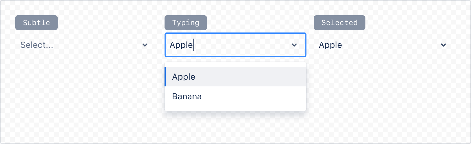
Appearance
Default
The default select appearance.
See the example on how the select component can be used in a Form: Form with all fields.
1
2const SelectAppearanceDefault= () => {
  return (
    <Select
      appearance="default"
      options={[
        { label: 'Apple', value: 'a' },
        { label: 'Banana', value: 'b' },
      ]}
    />
  );
}
Subtle
A select that's transparent until interaction or error.
1
2const SelectAppearanceSubtle= () => {
  return (
    <Select
      appearance="subtle"
      options={[
        { label: 'Apple', value: 'a' },
        { label: 'Banana', value: 'b' },
      ]}
    />
  );
}
Field label and helper message
Always use a label component for each field and associate the label to the field properly. Use the HelperMessage component for any optional field related message.
Required field label
For required fields, always add the RequiredAsterisk component next to the label.
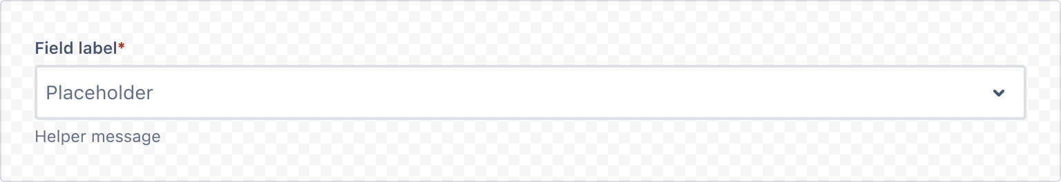
1
2import { Label, RequiredAsterisk, HelperMessage, Select } from '@forge/react';

const SelectFieldLabel = () => {
  return (
    <>
      <Label labelFor="select">Field label<RequiredAsterisk /></Label>
      <Select
        id="select"
        placeholder="Placeholder"
      />
      <HelperMessage>Helper message</HelperMessage>
    </>
  );
}
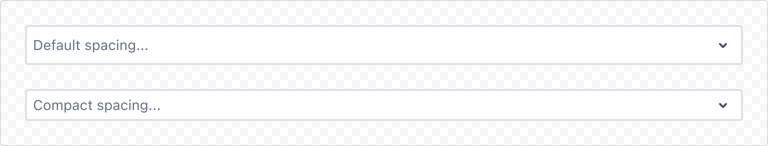
Spacing
Compact
A select with compact spacing.
1
2const SelectCompactSpacing = () => {
  return (
    <Select
      id="compact-select"
      spacing="compact"
      placeholder="Compact spacing..."
    />
  );
}
States
A select can be in different states such as disabled or invalid.
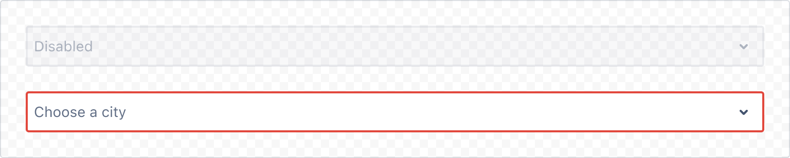
1
2const SelectStates = () => {
  return (
    <Stack space="space.200">
      <Select
        isDisabled
        placeholder="Disabled"
      />
      <Select
        isInvalid
        placeholder="Choose a city"
      />
    </Stack>
  );
}
Selection
Single select
Allows the user to select a single item from a dropdown list of options.
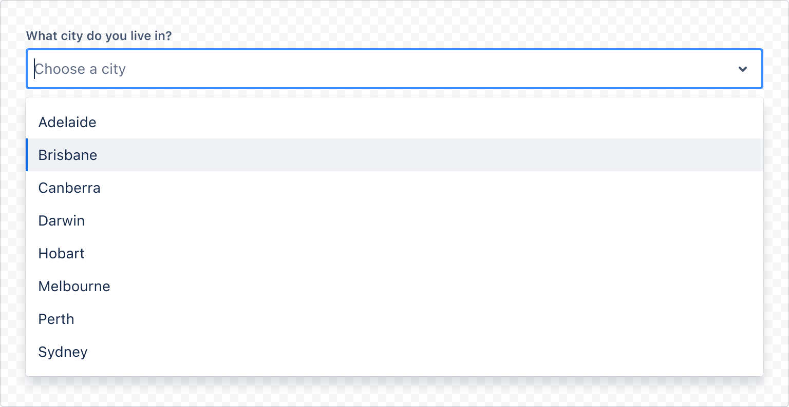
1
2const SelectSingleExample = () => (
  <>
    <Label labelFor="single-select-example">What city do you live in?</Label>
    <Select
      id="single-select-example"
      options={[
        { label: 'Adelaide', value: 'adelaide' },
        { label: 'Brisbane', value: 'brisbane' },
        { label: 'Canberra', value: 'canberra' },
        { label: 'Darwin', value: 'darwin' },
        { label: 'Hobart', value: 'hobart' },
        { label: 'Melbourne', value: 'melbourne' },
        { label: 'Perth', value: 'perth' },
        { label: 'Sydney', value: 'sydney' },
      ]}
      placeholder="Choose a city"
    />
  </>
);
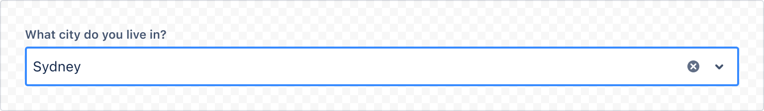
Single select clearable
Setting isClearable to true lets users clear their selection using the Backspace or Delete key.
1
2const SelectSingleClearable = () => (
  <>
    <Label labelFor="single-select-example-clearable">What city do you live in?</Label>
    <Select
      id="single-select-example-clearable"
      isClearable={true}
      options={[
        { label: 'Adelaide', value: 'adelaide' },
        { label: 'Brisbane', value: 'brisbane' },
        { label: 'Canberra', value: 'canberra' },
        { label: 'Darwin', value: 'darwin' },
        { label: 'Hobart', value: 'hobart' },
        { label: 'Melbourne', value: 'melbourne' },
        { label: 'Perth', value: 'perth' },
        { label: 'Sydney', value: 'sydney' },
      ]}
      placeholder="Choose a city"
    />
  </>
);
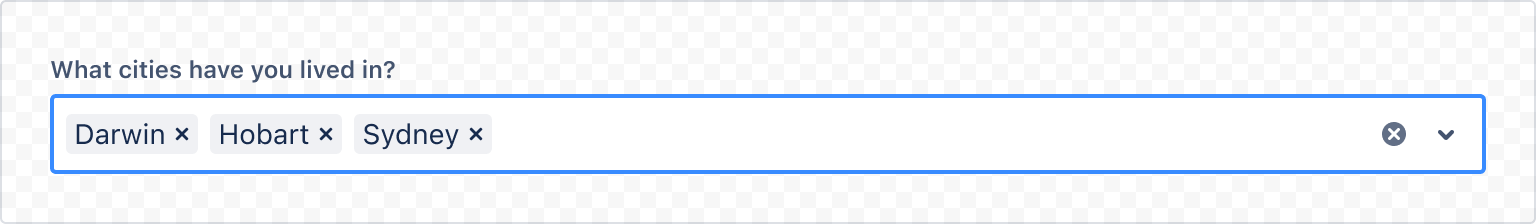
Multi select
Allows the user to select multiple items from a dropdown list of options.
1
2const SelectMultiExample = () => (
  <>
    <Label labelFor="multi-select-example">What cities have you lived in?</Label>
    <Select
      id="multi-select-example"
      options={[
        { label: 'Adelaide', value: 'adelaide' },
        { label: 'Brisbane', value: 'brisbane' },
        { label: 'Canberra', value: 'canberra' },
        { label: 'Darwin', value: 'darwin' },
        { label: 'Hobart', value: 'hobart' },
        { label: 'Melbourne', value: 'melbourne' },
        { label: 'Perth', value: 'perth' },
        { label: 'Sydney', value: 'sydney' },
      ]}
      isMulti
      isSearchable={false}
      placeholder="Choose a city"
    />
  </>
);
Grouped options
Related options can be grouped together in both a single and multi select.
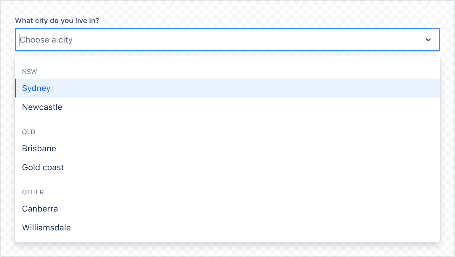
1
2const SelectGroupedOptionsExample = () => (
  <>
    <Label labelFor="grouped-options-example">What city do you live in?</Label>
    <Select
      id="grouped-options-example"
      options={[
        {
          label: 'NSW',
          options: [
            { label: 'Sydney', value: 's' },
            { label: 'Newcastle', value: 'n' },
          ],
        },
        {
          label: 'QLD',options: [
            { label: 'Brisbane', value: 'b' },
            { label: 'Gold coast', value: 'g' },
          ],
        },
        {
          label: 'Other',
          options: [
            { label: 'Canberra', value: 'c' },
            { label: 'Williamsdale', value: 'w' },
            { label: 'Darwin', value: 'd' },
            { label: 'Perth', value: 'p' },
          ],
        },
      ]}
      placeholder="Choose a city"
    />
  </>
);
Accessibility considerations
When using the Select component, we recommend keeping the following accessibility considerations in mind:
- Don’t use placeholder text to clarify field inputs – use the field label and helper text.
- Use a field label to indicate what information goes in the text input. Ensure the label is positioned outside the field so it remains visible at all times.
- Helper text can explain more about what to enter in the text input field. If the text is necessary to understand the field, put it above the text input (below the field label). Always keep this succinct.
- To avoid introducing multiple tab stops per text field, and to reduce keystrokes for assistive technology users, the clear control has been intentionally removed from the tab order. Keyboard users can clear content using the delete key.
Rate this page: