Create a logo designer app using the Frame component
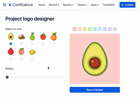
The app in this example showcases a logo designer and renders a preview of the designed icon within the Frame component.
The result will look like this:
This example illustrates the following:
- The integration of a
Framecomponent into a standard UI Kit app facilitates the embedding of standard static web app resources within the UI Kit Apps. This integration also unlocks features and flexibilities that are currently exclusive to Custom UI, but not available in UI Kit. - Establishing the communication mechanism between the UI Kit and the Frame component.
- Set up the Frame component to access and invoke the backend functions and handle asynchronous events using the Forge resolver.
If you're interested in examining the complete implementation of this app, you can clone or fork it from this repository: forge-ui-kit-frame-project-logo-designer
Before you begin
This tutorial assumes you're already familiar with the basics of Forge development. If this is your first time using Forge, see Getting started first.
Step 1: Create your app
Using your terminal complete the following:
-
Create your app by running:
1 2
forge create -
Enter a name for your app (up to 50 characters). For example, logo-designer.
-
Select the UI Kit category.
-
Select the Confluence Atlassian app.
-
Select the confluence-global-page template.
-
Change to the app subdirectory to see the app files:
1 2
cd logo-designer -
Install
@forge/reactversion10.2.0or higher. To install:npm install --save @forge/react@latestornpm install --save @forge/react@^10.2.0 -
Install
@forge/kvslatest version to be able to access Storage APIs:1 2
npm install @forge/kvs
Step 2: Create the web app resource
In this example, a static frontend resource for the Frame component is created using Create React App (CRA). However, other web frontend libraries are also viable options.
Prerequisites:
Make sure you've installed the most recent versions of the following:
- To verify the Node.js version, run:
node --version - To check the npm version, execute:
npm --version - To confirm the Yarn version (if applicable), type:
yarn --version
To create the web app resources:
-
Create the
resourcesfolder to add static frontend app:1 2
mkdir resources cd resources -
Create a react app:
1 2
yarn create react-app project-logo-display -
Setup CRA based react app to be used as Forge App based resources as described in here. Specifically, set
"homepage": "./"in theresources/project-logo-display/package.jsonfile:1 2
{ "name": "project-logo-display", "version": "0.1.0", "private": true, "homepage": "./", .... } -
Build assets:
1
2 cd project-logo-display
 yarn build
Step 3: Configure the app manifest
-
In the app’s top-level directory, open the
manifest.ymlfile. -
Find the
titleentry underconfluence:globalPage, and update the value toLogo Designer. -
Create a new resource with key equals to
logo-displayunder theresourcessection, and set the path pointing to the build folder of the target Frame component app as described in the previous step (i.e.,resources/project-logo-display/build).1 2
resources: - key: main path: src/frontend/index.jsx - key: logo-display path: resources/project-logo-display/build -
Configure the required app permissions:
- access to the Storage API to persist the logo configurations
- allow
unsafe-inlinefor CSS to allow manipulating logo styles - allow egress access to external images
You
manifest.ymlfile should look like the following:1 2
modules: confluence:globalPage: - key: logo-designer-hello-world-global-page resource: main render: native resolver: function: resolver title: Logo Designer route: logo-designer function: - key: resolver handler: index.handler resources: - key: main path: src/frontend/index.jsx - key: logo-display path: resources/project-logo-display/build permissions: scopes: - storage:app content: styles: - "unsafe-inline" external: images: - address: https://imgur.com - address: https://i.imgur.com" app: runtime: name: nodejs24.x id: '<your app id>'
Step 4: Modify the app content on the UI Kit side
- Create the following
.jsfiles and add the following code to store the list of logo images:src/frontend/constants.jsresources/project-logo-display/src/constants.js
Since this list will be utilized in both the UI Kit app and the Frame component, we will be duplicating files containing the constant that need to be generated in both the UI Kit app (src/frontend/constants.js) and the Frame component (resources/project-logo-display/src/constants.js).
1
2export const fruitSelectionMap = [
    { name: "Avocado", url: "https://imgur.com/CIsX0ZO.png" },
    { name: "Coconut", url: "https://imgur.com/lRHQMS9.png" },
    { name: "Pear", url: "https://imgur.com/YwiIGQA.png" },
    { name: "Red Apple", url: "https://imgur.com/wduDSGD.png" },
    { name: "Orange", url: "https://imgur.com/lSyCbHI.png" },
    { name: "Pomegranate", url: "https://imgur.com/aOHoUbj.png" },
    { name: "Peach", url: "https://imgur.com/1rBCiC3.png" },
    { name: "Lemon", url: "https://imgur.com/T1s8Pts.png" },
];
-
Create the components in the UI Kit components folder (
src/frontend/components), which includes:-
src/frontend/components/BorderRadiusSlider.jsx: To adjust the border radius of the logo container.1 2
import React from "react"; import { Stack, Text, Range } from "@forge/react"; export const BorderRadiusSlider = ({ value, onChange }) => { return ( <Stack space="space.200"> <Text>Radius</Text> <Range value={value} min={0} max={100} onChange={onChange} /> </Stack> ); }; -
src/frontend/components/FruitIcon.jsx: To represent individual icons.1 2
import React, { useCallback } from "react"; import { Stack, Radio, Image } from "@forge/react"; export const FruitIcon = ({ name, url, isChecked, onChange }) => { const handleChange = useCallback((event) => { if (onChange) { onChange(event.target.value); } }, []); return ( <Stack alignInline="center"> <Image src={url} alt={name} size="xlarge" /> <Radio name="icon" value={name} onChange={handleChange} isChecked={isChecked} /> </Stack> ); }; -
src/frontend/components/IconSelection.jsx: To capture logo icon selection.1 2
import React from "react"; import { Stack, Text, Inline } from "@forge/react"; import { FruitIcon } from "./FruitIcon"; import { fruitSelectionMap } from "../constants"; export const IconSelection = ({ value, onChange }) => { return ( <Stack space="space.200"> <Text>Select an icon</Text> <Inline shouldWrap> {fruitSelectionMap.map(({ name, url }) => ( <FruitIcon key={name} name={name} url={url} isChecked={name === value} onChange={onChange} /> ))} </Inline> </Stack> ); };
-
-
Update the
src/frontend/index.jsxfile to connect the basic frontend components described above for the initial draft on the UI Kit side.1 2
import React from "react"; import ForgeReconciler, { Inline, Stack, Heading, Frame } from "@forge/react"; import { IconSelection } from "./components/IconSelection"; import { BorderRadiusSlider } from "./components/BorderRadiusSlider"; const App = () => { const [config, setConfig] = React.useState({ icon: "Avocado", radius: 20 }); // TODO: setup logo update and preview logic const handleConfigChange = ({ key, value }) => { console.log(key, value); setConfig((prevConfig) => ({ ...prevConfig, [key]: value })); }; return ( <Stack space="space.400"> <Heading as="h1">Project logo designer</Heading> <Inline space="space.400"> <Stack space="space.1000"> <IconSelection value={config.icon} onChange={(value) => handleConfigChange({ key: "icon", value }) } /> <BorderRadiusSlider value={config.radius} onChange={(value) => handleConfigChange({ key: "radius", value }) } /> </Stack> {/* TODO: Setup logo display component */} </Inline> </Stack> ); }; ForgeReconciler.render( <React.StrictMode> <App /> </React.StrictMode> );
Step 5: Modify the app content on the Frame component side
-
Start by navigating to the target
Framecomponent project folder, which is located atresources/project-logo-display/1 2
cd resources/project-logo-display/ -
Add the required libraries and dependencies:
1 2
yarn add @atlaskit/css-reset \ @atlaskit/button \ @atlaskit/primitives \ @atlaskit/tokens \ @atlaskit/tooltip \ @atlaskit/visually-hidden \ @forge/bridge \ styled-components -
Setup and initialise common frameworks and libraries (example, Atlassian Design Tokens, Styled Components) by updating the
resources/project-logo-display/src/index.jsfile:1 2
import React from "react"; import ReactDOM from "react-dom"; import { createGlobalStyle } from "styled-components"; import { view } from "@forge/bridge"; import { token } from "@atlaskit/tokens"; import App from "./App"; import "@atlaskit/css-reset"; // Enables theming view.theme.enable(); const GlobalStyle = createGlobalStyle` body { background: ${token("elevation.surface")}; } `; ReactDOM.render( <React.StrictMode> <GlobalStyle /> <App /> </React.StrictMode>, document.getElementById("root") ); -
Go to
resources/project-logo-display/src/componentsand create the necessary components in the Frame component folder which includes:-
resources/project-logo-display/src/components/LogoDisplay.jsx: Container to preview logo style changes.1 2
import React from "react"; import { fruitSelectionMap } from "../constants"; import styled from "styled-components"; import { token } from "@atlaskit/tokens"; const LogoBackground = styled.div` width: 280px; height: 280px; background-color: ${({ color }) => color ? token(`color.background.accent.${color}.subtler`) : token("color.background.neutral")}; border-radius: ${({ borderRadius }) => borderRadius}px; `; const iconUrls = fruitSelectionMap.reduce((acc, fruit) => { acc[fruit.name] = fruit.url; return acc; }, {}); export const LogoDisplay = ({ icon, radius, color }) => { return ( <LogoBackground borderRadius={radius} color={color}> <img alt="logo-img" src={iconUrls[icon]} style={{ width: "280px", height: "280px", display: "block" }} /> </LogoBackground> ); }; -
resources/project-logo-display/src/components/ColorPalette.jsx: input component for capturing logo color selections.1 2
import React from "react"; import { Inline, Pressable, xcss } from "@atlaskit/primitives"; import Tooltip from "@atlaskit/tooltip"; import VisuallyHidden from "@atlaskit/visually-hidden"; const baseStyles = xcss({ borderWidth: "border.width", borderStyle: "solid", borderColor: "color.border", borderRadius: "border.radius", height: "20px", width: "20px", display: "flex", alignItems: "center", justifyContent: "center", }); const borderSelected = xcss({ borderColor: "color.border.bold", }); const colorMap = [ "red", "orange", "yellow", "lime", "green", "teal", "blue", "purple", "magenta", ].reduce((acc, color) => { acc[color] = xcss({ backgroundColor: `color.background.accent.${color}.subtler`, ":hover": { backgroundColor: `color.background.accent.${color}.subtler.hovered`, }, ":active": { backgroundColor: `color.background.accent.${color}.subtler.pressed`, }, }); return acc; }, {}); const ColorButton = ({ color, isSelected, onClick }) => { const pressableStyles = [baseStyles, colorMap[color]]; return ( <Tooltip content={color}> <Pressable interactionName={`color-${color}`} xcss={ isSelected ? [...pressableStyles, borderSelected] : pressableStyles } aria-pressed={isSelected} onClick={onClick} > <VisuallyHidden>{color}</VisuallyHidden> </Pressable> </Tooltip> ); }; export const ColorPalette = ({ value, onChange }) => { return ( <Inline space="space.100"> {Object.keys(colorMap).map((color) => { return ( <ColorButton key={color} color={color} isSelected={color === value} onClick={() => { onChange(color); }} /> ); })} </Inline> ); };
-
-
Update the
resources/project-logo-display/src/App.jsfile to connect the basic frontend components described above for the initial draft on theFramecomponent side.You
App.jsfile should look like the following:1 2
import React from "react"; import { ColorPalette } from "./components/ColorPalette"; import { LogoDisplay } from "./components/LogoDisplay"; import { Stack } from "@atlaskit/primitives"; function App() { const [config, setConfig] = React.useState({ icon: "Avocado", radius: 20, color: "red", }); const handleConfigChange = ({ key, value }) => { setConfig((prevConfig) => ({ ...prevConfig, [key]: value })); }; // TODO: setup logic to track log update requests from the UI Kit side. return ( <Stack space="space.200"> <ColorPalette value={config.color} onChange={(value) => handleConfigChange({ key: "color", value }) } /> <LogoDisplay icon={config.icon} radius={config.radius} color={config.color} /> </Stack> ); } export default App;
Step 6: Set up the Frame component inside UI Kit App
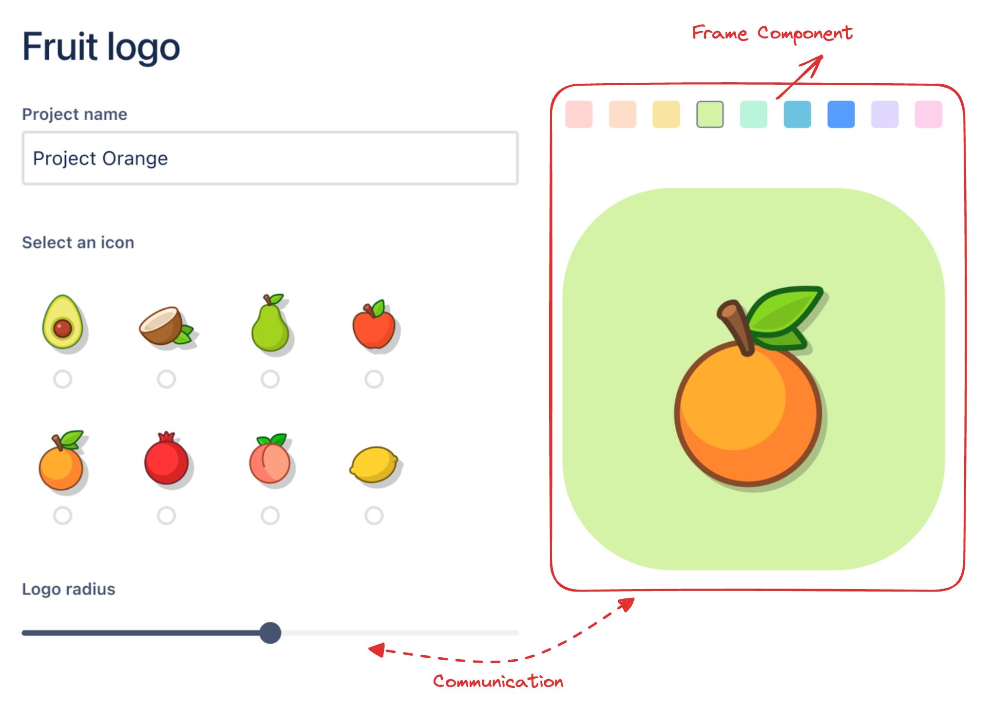
Now, we are ready to include the Logo Display Frame Component into the main UI Kit app.
-
Run the following command to ensure the
Framecomponent frontend resources are properly build and compiled.1 2
yarn build -
Ensure the build artefacts are generated in the
resources/project-logo-display/buildfolder, as this folder is linked to theresourcessection in themanifest.ymlfile. -
In the
src/frontend/index.jsx, update the UI Kit app to include theFramecomponent with theFrametag with resource prop pointing to the key attribute of the targetFrameresources as specified in themanifest.ymlfile.1 2
// ..... const App = () => { const [config, setConfig] = React.useState({ icon: "Avocado", radius: 20 }); // TODO: setup logo update and preview logic const handleConfigChange = ({ key, value }) => { console.log(key, value); setConfig((prevConfig) => ({ ...prevConfig, [key]: value })); }; return ( <Stack space="space.400"> <Heading as="h1">Project logo designer</Heading> <Inline space="space.400"> <Stack space="space.1000"> <IconSelection value={config.icon} onChange={(value) => handleConfigChange({ key: "icon", value }) } /> <BorderRadiusSlider value={config.radius} onChange={(value) => handleConfigChange({ key: "radius", value }) } /> </Stack> <Frame resource="logo-display" /> </Inline> </Stack> ); }; // .....
Step 7: Enable communication between the UI Kit and the Frame component
You can use the Events API on @forge/bridge to communicate between the UI Kit (main app) and the Frame component. The communication mechanism is utilised in this example to enable the logo design controls (logo picker, radius slider, and so on) to modify the logo preview component within the Frame component.
-
Create the React hooks to abstract the underlying communication implementation. Copy the following
hooks.jsimplementation into both UI Kit and Frame component sides:-
Go to the following files,
src/frontend/hooks.jsandresources/project-logo-display/src/hooks.jsand add the following code:1 2
import { useEffect, useState, useCallback } from "react"; import { events } from "@forge/bridge"; const LOGO_CONFIG_UPDATES_EVENT = "LOGO_CONFIG_UPDATES"; export const useLogoConfigUpdates = () => { const [configUpdates, setConfigUpdates] = useState([]); useEffect(() => { const sub = events.on(LOGO_CONFIG_UPDATES_EVENT, (message) => { if ( message && message.updates !== undefined && message.updates.length > 0 ) { setConfigUpdates(message.updates); } }); return () => { sub.then((subscription) => subscription.unsubscribe()); }; }, [setConfigUpdates]); const emitConfigUpdates = useCallback((updates) => { events.emit(LOGO_CONFIG_UPDATES_EVENT, { updates }); }, []); return [configUpdates, emitConfigUpdates]; };
-
-
Go to
src/frontend/index.jsxto dispatch radius slider and icon selector changes from the UI Kit side.1 2
import { useLogoConfigUpdates } from "./hooks"; // ..... const App = () => { const [config, setConfig] = React.useState({ icon: "Avocado", radius: 20 }); const [_, emitLogoConfigUpdates] = useLogoConfigUpdates(); React.useEffect(() => { // sending through logo config updates through events API whenever // config object changes is detected. emitLogoConfigUpdates( Object.entries(config).map(([key, value]) => ({ key, value })) ); }, [config]); const handleConfigChange = ({ key, value }) => { setConfig((prevConfig) => ({ ...prevConfig, [key]: value })); }; return ( <Stack space="space.400"> <Heading as="h1">Project logo designer</Heading> <Inline space="space.400"> <Stack space="space.1000"> <IconSelection value={config.icon} onChange={(value) => handleConfigChange({ key: "icon", value }) } /> <BorderRadiusSlider value={config.radius} onChange={(value) => handleConfigChange({ key: "radius", value }) } /> </Stack> <Frame resource="logo-display" /> </Inline> </Stack> ); }; // ..... -
Go to
resources/project-logo-display/src/App.jsand listen for logo configuration updates, and adjust the logo preview within theFramecomponent accordingly.1 2
import React from "react"; import { ColorPalette } from "./components/ColorPalette"; import { LogoDisplay } from "./components/LogoDisplay"; import { Stack } from "@atlaskit/primitives"; import { useLogoConfigUpdates } from "./hooks"; function App() { const [config, setConfig] = React.useState({ icon: "Avocado", radius: 20, color: "red", }); // track logo update requests from the UI Kit side. const [logoConfigUpdates] = useLogoConfigUpdates(); React.useEffect(() => { if (logoConfigUpdates && logoConfigUpdates.length > 0) { // upon receiving the config updates, apply the updates to the current // config state to update the logo preview. setConfig((prevConfig) => { const updatedConfig = { ...prevConfig }; logoConfigUpdates.forEach((update) => { updatedConfig[update.key] = update.value; }); return updatedConfig; }); } }, [logoConfigUpdates, setConfig]); const handleConfigChange = ({ key, value }) => { setConfig((prevConfig) => ({ ...prevConfig, [key]: value })); }; return ( <Stack space="space.200"> <ColorPalette value={config.color} onChange={(value) => handleConfigChange({ key: "color", value }) } /> <LogoDisplay icon={config.icon} radius={config.radius} color={config.color} /> </Stack> ); } export default App;
Step 8: Invoke backend FaaS function from Frame component
Frame component can invoke the FaaS function resources (resolvers) that are defined within its containing UI Kit App. In this example, Storage is utilised to persist and load the logo configuration, and the Storage API operations will be wrapped inside the Forge resolvers, and will be invoked from both UI Kit side and inside the Frame component.
-
Go to
src/resolvers/index.jsto create resolver functions for persisting and fetching logo configurations. Replace the exisitng code with the following:1 2
import Resolver from "@forge/resolver"; import { kvs } from "@forge/kvs"; const LOGO_CONFIG_STORAGE_KEY = "LOGO_CONFIG"; // Move default configuration to the shared backend to remove the duplicated // logics in the frontend. const defaultLogoConfig = { icon: "Avocado", radius: 20, color: "red", }; const resolver = new Resolver(); resolver.define("setLogoConfig", async ({ payload: { config } }) => { return await kvs.set(LOGO_CONFIG_STORAGE_KEY, config); }); resolver.define("getLogoConfig", async () => { let config = null; try { config = await kvs.get(LOGO_CONFIG_STORAGE_KEY); } catch (e) {} return config || defaultLogoConfig; }); export const handler = resolver.getDefinitions(); -
Ensure the resolver function defined above is linked in the
manifest.ymlfile.1 2
# file path: manifest.yml modules: # ... function: - key: resolve handler: index.handler -
Go to
src/hooks.jsandresources/project-logo-display/src/hooks.jsand add the following code to wrap the resolver functions with react hooks to enhance usability in react.1 2
import { useEffect, useState, useCallback } from "react"; import { events, invoke } from "@forge/bridge"; // .... export const useGetLogoConfigFromStorage = () => { const [config, setConfig] = useState(null); useEffect(() => { // this works in both UI Kit and inside Frame component. invoke("getLogoConfig").then((config) => { setConfig(config); }); }, [setConfig]); return config; }; export const useSetLogoConfigToStorage = () => { return useCallback((config) => { invoke("setLogoConfig", { config }); }, []); }; -
In the
src/frontend/index.jsxadd the following code to set up UI Kit to load the logo configuration with storage API using the hooks defined in the previous steps.1 2
import React, { useEffect } from "react"; import ForgeReconciler, { Inline, Stack, Heading, Frame, } from "@forge/react"; import { IconSelection } from "./components/IconSelection"; import { BorderRadiusSlider } from "./components/BorderRadiusSlider"; import { useLogoConfigUpdates, useGetLogoConfigFromStorage, } from "./hooks"; const LogoDesignControlPanel = ({ logoConfig: initialConfig }) => { const [config, setConfig] = React.useState(initialConfig); const [_, emitLogoConfigUpdates] = useLogoConfigUpdates(); useEffect(() => { emitLogoConfigUpdates( Object.entries(config).map(([key, value]) => ({ key, value })) ); }, [config]); const handleConfigChange = ({ key, value }) => { setConfig((prevConfig) => ({ ...prevConfig, [key]: value })); }; return ( <Stack space="space.400"> <Heading as="h1">Project logo designer</Heading> <Inline space="space.400"> <Stack space="space.1000"> <IconSelection value={config.icon} onChange={(value) => handleConfigChange({ key: "icon", value }) } /> <BorderRadiusSlider value={config.radius} onChange={(value) => handleConfigChange({ key: "radius", value }) } /> </Stack> <Frame resource="logo-display" /> </Inline> </Stack> ); }; const App = () => { // Load the configuration from the storage API const logoConfig = useGetLogoConfigFromStorage(); if (!logoConfig) { return null; } // Move the logo design control logic into a dedicated component. return <LogoDesignControlPanel logoConfig={logoConfig} />; }; ForgeReconciler.render( <React.StrictMode> <App /> </React.StrictMode> ); -
Go to
resources/project-logo-display/src/App.jsand add the following code to set up theFramecomponent to load and persist the logo configuration with storage API using the hooks defined in the previous steps.1 2
import React, { useEffect } from "react"; import { ColorPalette } from "./components/ColorPalette"; import { LogoDisplay } from "./components/LogoDisplay"; import { Stack } from "@atlaskit/primitives"; import Button from "@atlaskit/button"; import { useLogoConfigUpdates, useGetLogoConfigFromStorage, useSetLogoConfigToStorage, } from "./hooks"; const LogoDesignPanel = ({ logoConfig: initialConfig }) => { const [config, setConfig] = React.useState(initialConfig); const [logoConfigUpdates] = useLogoConfigUpdates(); const storeLogoConfig = useSetLogoConfigToStorage(); useEffect(() => { if (logoConfigUpdates && logoConfigUpdates.length > 0) { setConfig((prevConfig) => { const updatedConfig = { ...prevConfig }; logoConfigUpdates.forEach((update) => { updatedConfig[update.key] = update.value; }); return updatedConfig; }); } }, [logoConfigUpdates, setConfig]); const handleConfigChange = ({ key, value }) => { setConfig((prevConfig) => ({ ...prevConfig, [key]: value })); }; return ( <Stack space="space.200" alignInline="start"> <Stack alignInline="center" space="space.200"> <ColorPalette value={config.color} onChange={(value) => handleConfigChange({ key: "color", value }) } /> <Stack space="space.200"> <LogoDisplay icon={config.icon} radius={config.radius} color={config.color} /> {/* Persist the logo configuration to storage api */} <Button appearance="primary" onClick={() => storeLogoConfig(config)} > Save changes </Button> </Stack> </Stack> </Stack> ); }; function App() { // Load the configuration from the storage API const logoConfig = useGetLogoConfigFromStorage(); if (!logoConfig) { return null; } return <LogoDesignPanel logoConfig={logoConfig} />; } export default App;
Install your app
To use your app, it must be installed onto an Atlassian site. The
forge deploy command builds, compiles, and deploys your code; it'll also report any compilation errors.
The forge install command then installs the deployed app onto an Atlassian site with the
required API access.
You must run the forge deploy command before forge install because an installation
links your deployed app to an Atlassian site.
-
Navigate to the app's top-level directory and deploy your app by running:
1 2
forge deploy -
Install your app by running:
1 2
forge install -
Select your Atlassian context using the arrow keys and press the enter key.
-
Enter the URL for your development site. For example, example.atlassian.net. View a list of your active sites at Atlassian administration.
Once the successful installation message appears, your app is installed and ready
to use on the specified site.
You can always delete your app from the site by running the forge uninstall command.
View your app
With your app installed, it’s time to see the app on a page.
- Edit a Confluence page in your development site.
- Type
/ - Find the macro app by name in the menu that appears and select it.
- Publish the page.
That’s it. You now have a Forge app that renders a preview of the designed icon within the Frame component.
Rate this page: