Guidelines for action components

Actions are the 'doers' of an automation rule. They allow users to perform tasks automatically. Examples of actions can include:
- Sending notifications, like Slack messages and emails
- Creating Confluence pages
- Transitioning work items
If you're looking to contribute actions to Atlassian Automation, use the following guidelines to learn best practice for designing action icons, as well as naming and writing clear descriptions for them. This will help to ensure that your action is consistent with others in Atlassian Automation.
Action icons
Action icons visually represent what the action does, helping users to quickly identify and understand its functionality. As such, action icons should clarify the action's intent.
Visual specifications
Third-party actions are gray. To differentiate third-party actions from host actions, use the token colour/background/accent/blue/subtlest.
DO use an updated icon, with our official colour token as the background
DON'T use background colours that differ from our recommended token
What icon do I use?
-
Use the official product icon for third party product-related actions. Using the official product icon ensures users can immediately recognise the third-party service your action integrates with.
-
Source the logo directly from the product's official site. This is important for both legal and user experience reasons, as it signals to users that the integration is legitimate and current. For example, you can find GitHub's official logos at https://github.com/logos.
-
Use logomarks as SVG elements. SVGs ensure icons are crisp and scalable at any size, maintain visual consistency across different displays.
DO use the most updated product icon as an SVG file.
DON'T use an unofficial product icon as a rasterised PNG file.
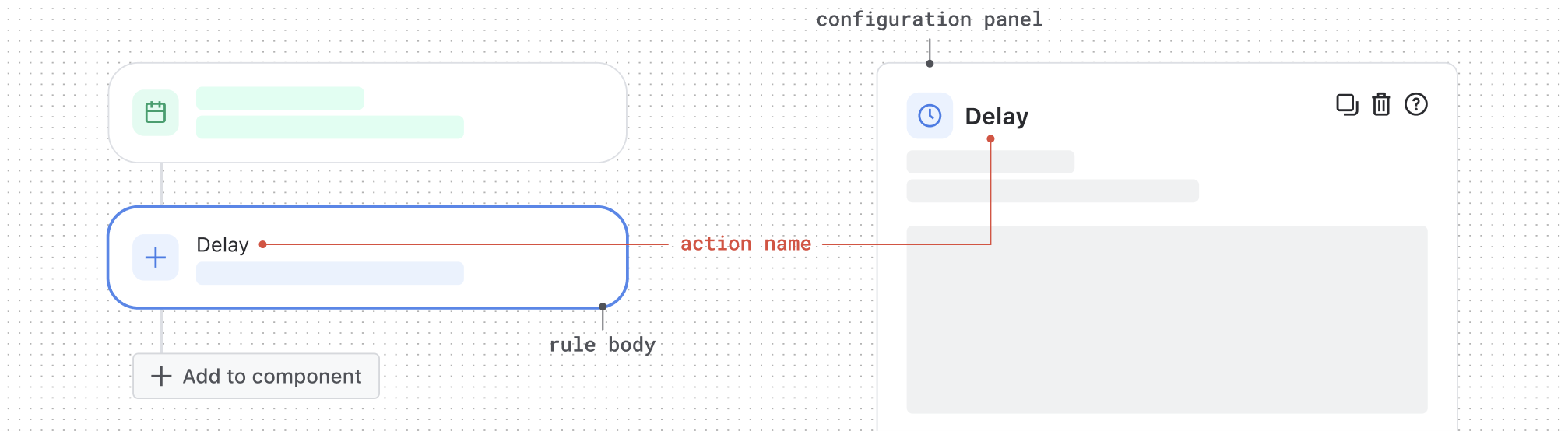
Action names
The action name provides a concise summary of what the action will do. It lives in both the rule body and the configuration panel.
Naming conventions
-
Write using the format:
<verb> in/for/with/etc. <object>. Start with a base verb, add a preposition, and finish with the object. Apply the same naming structure across all third-party actions for clarity and predictability. For example, Create work item or Send email. -
Describe the action that the rule will take. Use clear, specific language so users instantly understand what the action does.
-
Keep the name within a single line. A good rule of thumb is to use 3 to 6 words. Short names are easier to scan and keep the UI clean and readable.
DO follow the advised format.

DON'T deviate from the recommended naming convention
Descriptions
The action description offers more detail to the action name, explaining exactly what will happen when the rule is triggered. For the best and consistent user experience, it is required for all actions to have action descriptions.
Descriptions in the rule body
Pre-configured state
-
Provide more detail. This is an opportunity to tell the user what specific action will be taken once the rule is triggered.
-
Keep the description length to 1 to 2 lines.
-
Write in sentence case. Start with a capital letter and use standard sentence punctuation (unless referring to a product), making the description professional and easy to read.
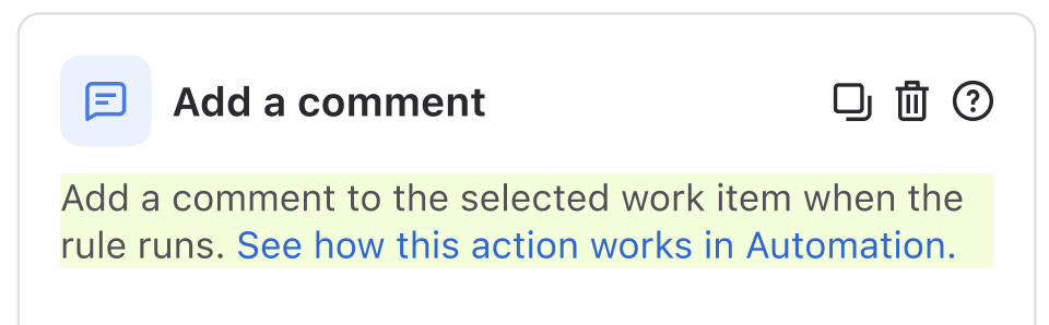
DO keep descriptions brief to 1-2 lines, using the advised format.
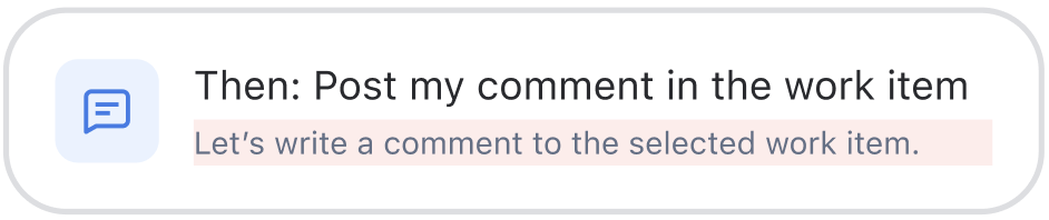
DON'T use playful language like 'Let's'. Reserve it for more suitable materials like marketing.
Descriptions in the configuration panel
-
Keep content similar to the rule body. Use this space to expand on the rule body by providing extra detail where needed, so users understand exactly what each component does in the configuration panel.
-
Keep descriptions under 3 to 4 lines. Short, focused descriptions help maintain clarity and make the panel easy to scan and understand.
-
Write clear descriptive CTAs. Writing clear descriptive CTAs help users understand exactly what to expect when they click. This improves clarity and engagement.
-
Add a description to every component. No component should be left without a description so that we can support a consistent and intuitive user experience.
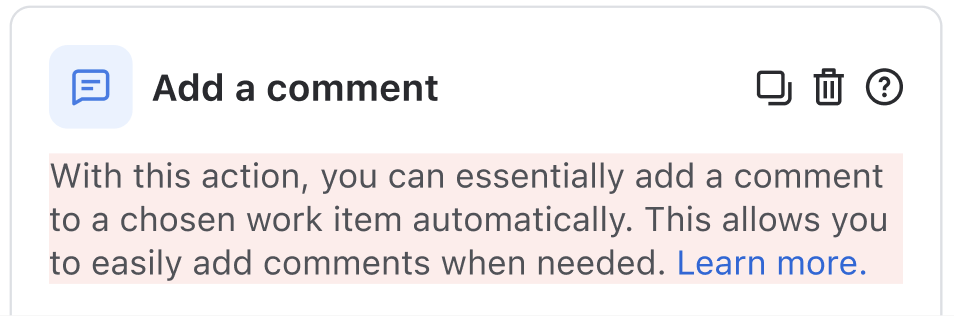
DO keep descriptions brief under 3–4 lines and aligned with the rule body.
DON'T use filler words and generic CTAs like 'Learn more.' Use clear labels as outlined in these standards.
Input elements
Input methods let users make choices when configuring an action in Automation. Knowing how to design and choose input methods helps make the process clearer and more efficient for users when they use the action you've built.
Common mistakes to avoid
Stick to Atlassian Design System (ADS) input components for all standard input elements and layout. This means:
No nested navigation
- Do not introduce any form of nested navigation (e.g., tabs within tabs, accordions within panels, or multi-step flows inside the configuration panel). The configuration panel should be a single, flat surface where all configuration options are visible or easily accessible.
No embedded content
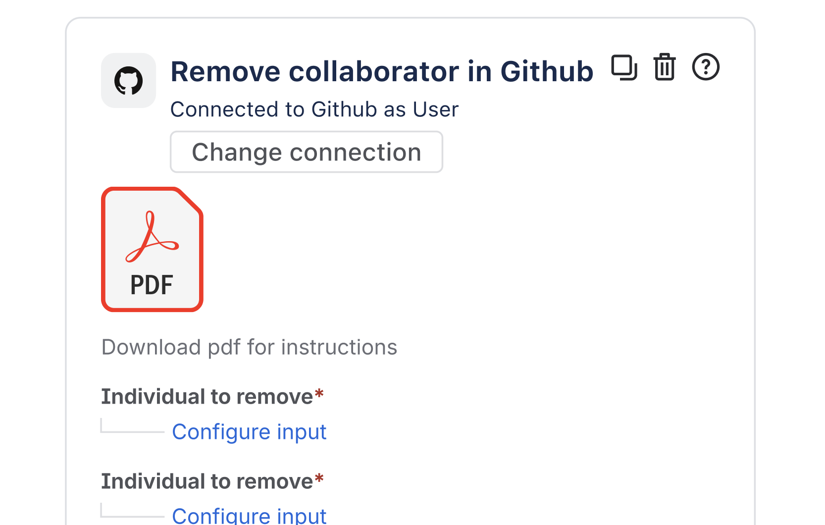
- Do not embed videos, PDFs, or other rich media directly within the configuration panel.
- Avoid iframes, document viewers, or any interactive content that is not a native part of the configuration UI.
DO use our design components in a single flat surface where all configuration options are visible.
DON'T embed rich media such as PDFs, or use components that don't belong to our design system.
Choosing the right input method
When choosing the most appropriate input method, consider factors such as:
- The number of options
- How many options the user needs to select
Here's some guidance on what input method would be best suited to your action:
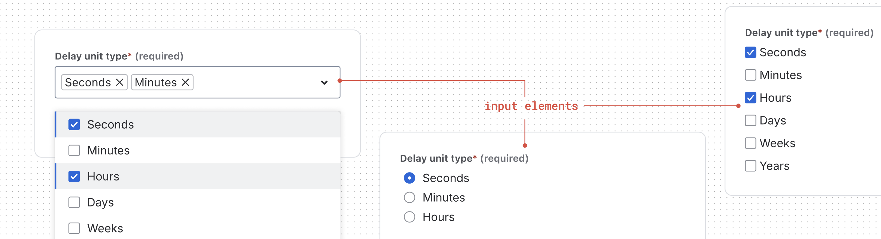
| Number of options to select from | User can only select 1 option | User can select more than 1 option |
|---|---|---|
| Equal to or less than 3 | Use a radio button | Checkboxes or a multi-select |
| Equal to or more than 5 | Use a single-select | Use a multi-select |
Input elements for unknown number of options
For handling input elements when you don't know the option number in advance, such as when options are fetched from an external API or database, start with a search-enabled dropdown. This approach can gracefully adapt to any scenario - from zero options to thousands.
Types of input elements
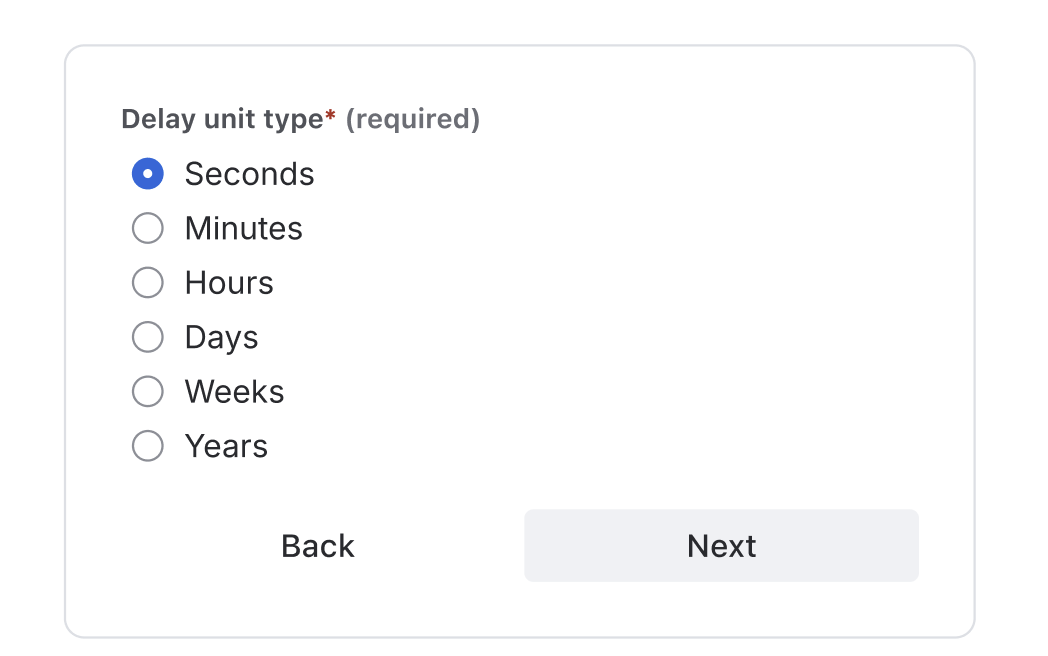
Single-select
Use for lists of 5 or more options where only one selection is needed. Drop-downs work best when you have too many choices to display inline but need users to pick a single option.
See best practices for drop-downs.
DO use when selecting one option from a longer list (5-6 or more options)
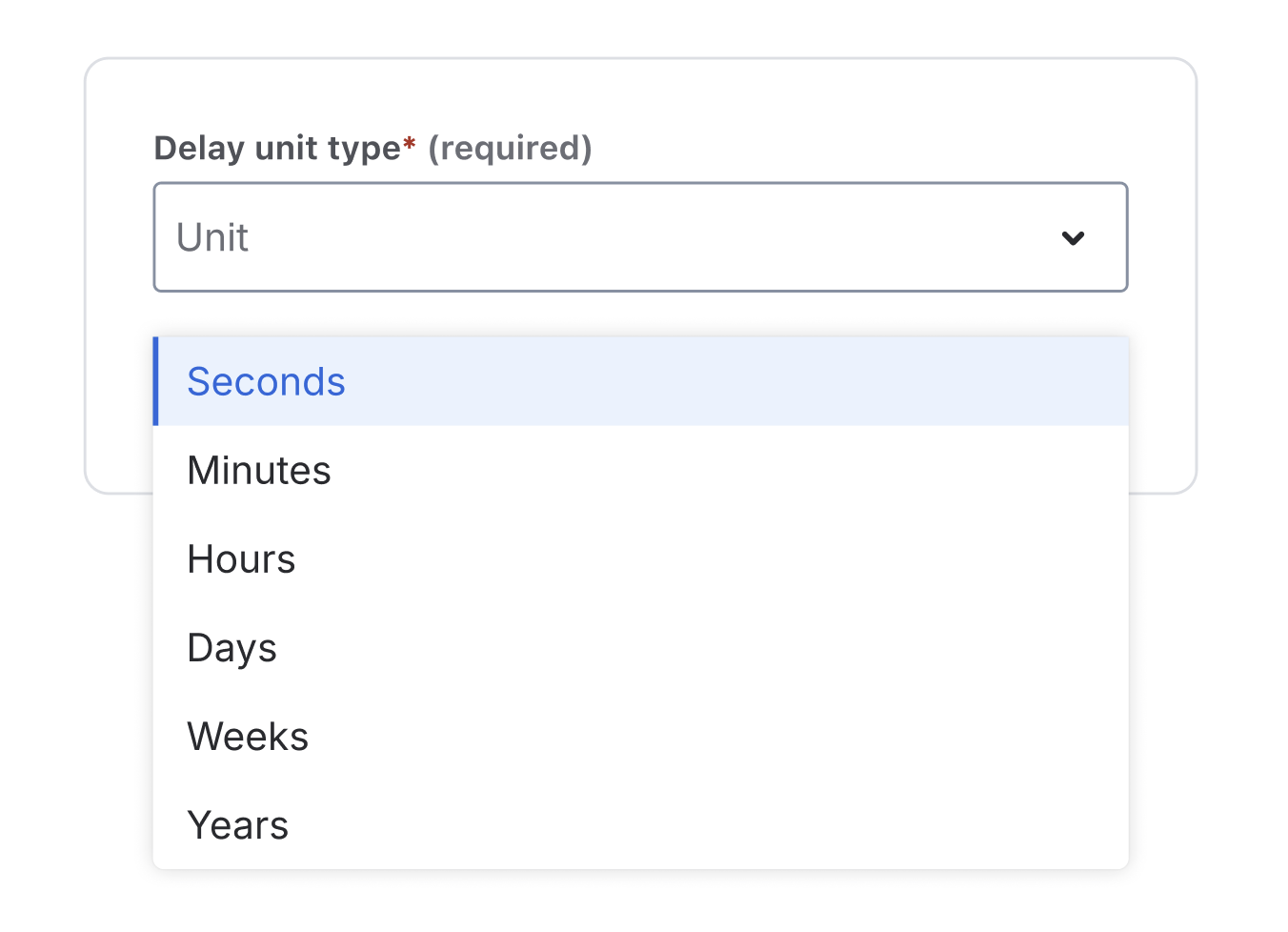
DON'T use drop-downs to select one option from 2 options. Use radio buttons.
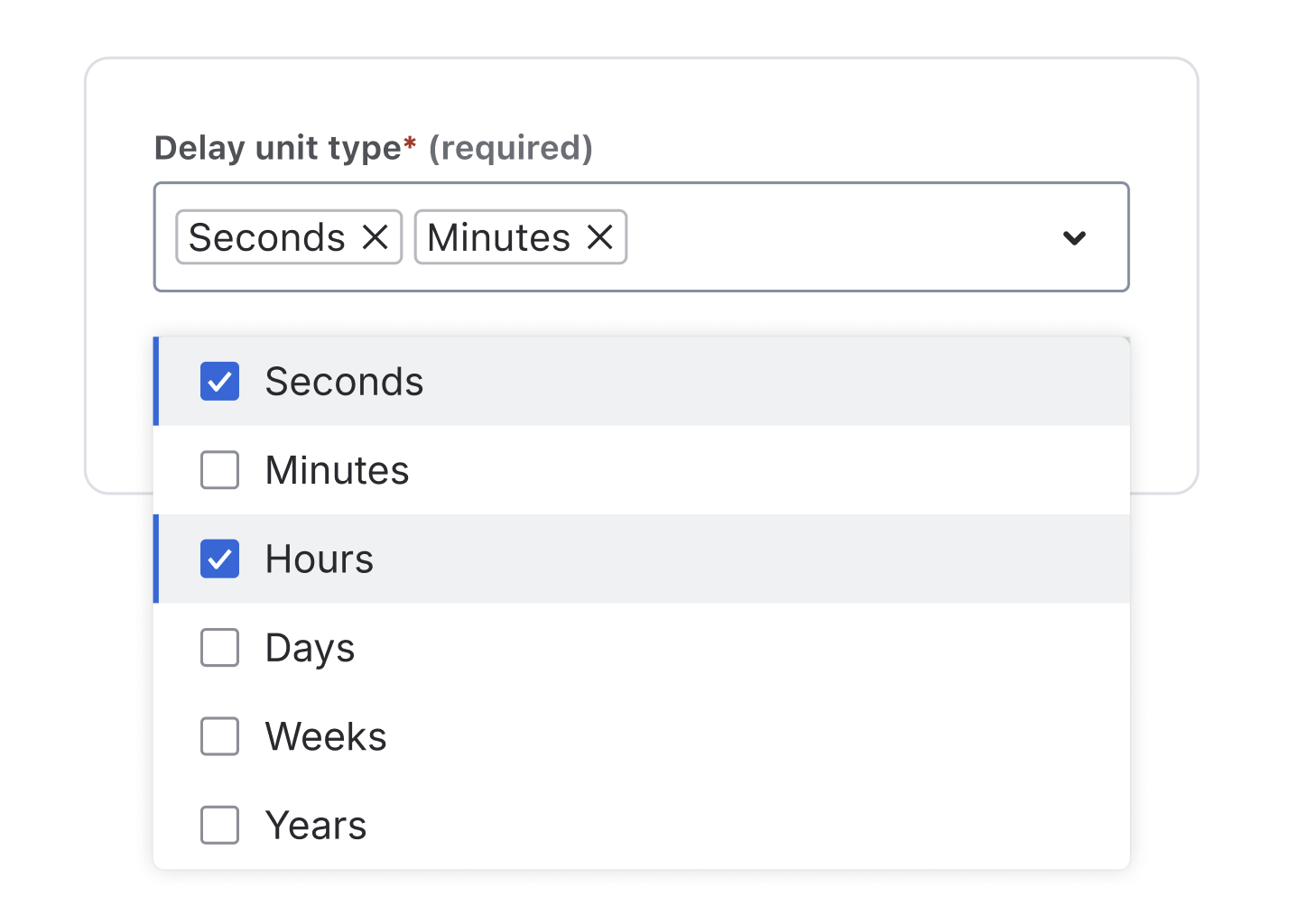
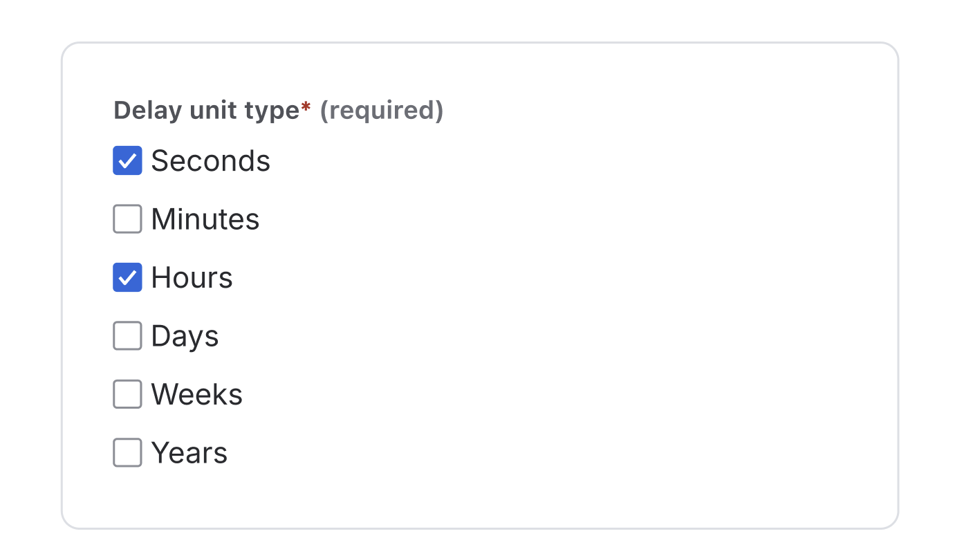
Multi-select
Use for lists of 5 or more options where one or more selections are needed. Multi-select components keep long lists manageable by collapsing options into a compact, searchable interface. For smaller sets (2–5 options), use checkboxes for better visibility and quicker selection.
DO use when selecting multiple options from a medium or long list.
DON'T use checkboxes for long lists. Reserve them for 1-3 options instead.
Radio buttons
Use radio buttons for 2-3 mutually exclusive options. Radio buttons work best when you have a small set of choices where users can only select one option and need to see all available choices.
See best practices for radio buttons.
DO use when selecting one option from a small, visible list of 2-3 options.
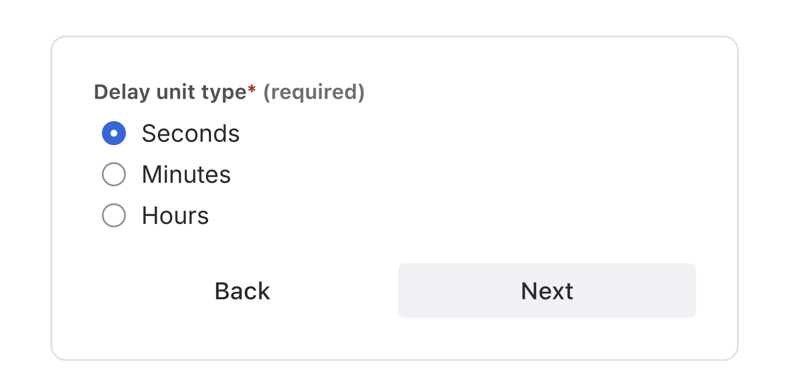
DON'T use radio buttons for more than 3 options; use drop-downs for longer lists.
Key takeaways
- Icons: Use official product icons as SVGs with the correct color token
- Names: Follow the
<verb> <preposition> <object>format, keep it 3-6 words - Descriptions: Be clear and concise (1-2 lines in rule body, 3-4 lines in config panel)
- Input elements: Choose the right component based on the number of options and selection requirements
- Design system: Always stick to Atlassian Design System components
For more detailed information, refer to the Atlassian Design System.
Rate this page: