Feedback
Whenever a customer churns an app (unsubscribes, uninstalls or disables), they provide feedback on the reason why they are churning.
The Feedback report is a statistic built on top of the raw data from the feedback details. It displays the reasons provided by partners while churning. The details are charted out on a graph and also shown on a table.
You can customize the dates and filter your feedback by reason or type as well as on the basis of the source from which it is trickling in.
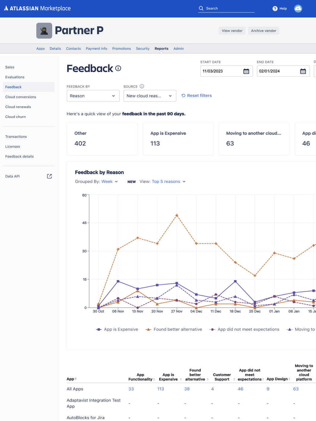
Filters
Filters offer different kinds of customizations:
- Date range: This filter provides multiple iterations to customize the dates. All the dates
displayed are in UTC. These are your options:
- All dates
- Last 30 days
- Last 90 days
- This month to date
- Last month
- Year to date
- Last year
- Custom
- Reason: You can customize the reports based on the reason that the customer provided
while churning. It can be any of these:
- App functionality
- App is expensive
- We are moving to another cloud platform
- I found a better alternative for this app
- Customer support
- The app did not meet my expectations
- App design
- Other
- Type: You can customize the reports based on the type of churn it was.
- Uninstall: When a customer uninstalls an app, it is removed from their instance and all their data is lost.
- Unsubscribe: When a customer unsubscribes to a cloud app, the license gets cancelled and the payment is stopped. However, all the data on that particular instance for that app is retained.
- Disable: When a customer disables an app for server and Data Center, the license gets cancelled and the payment is stopped. However, all the data on that particular instance for that app is retained.
- Source: You can customize the reports based on the source at which the feedback was collected.
- New cloud reasons: Source from which feedback is collected on feedback pages for all cloud apps.
- Manage apps: The Manage apps section for server and Data Center apps is a source of collecting feedback.
- Admin hub: The Admin hub section of server and Data Center apps is a source of collecting feedback.
Graph
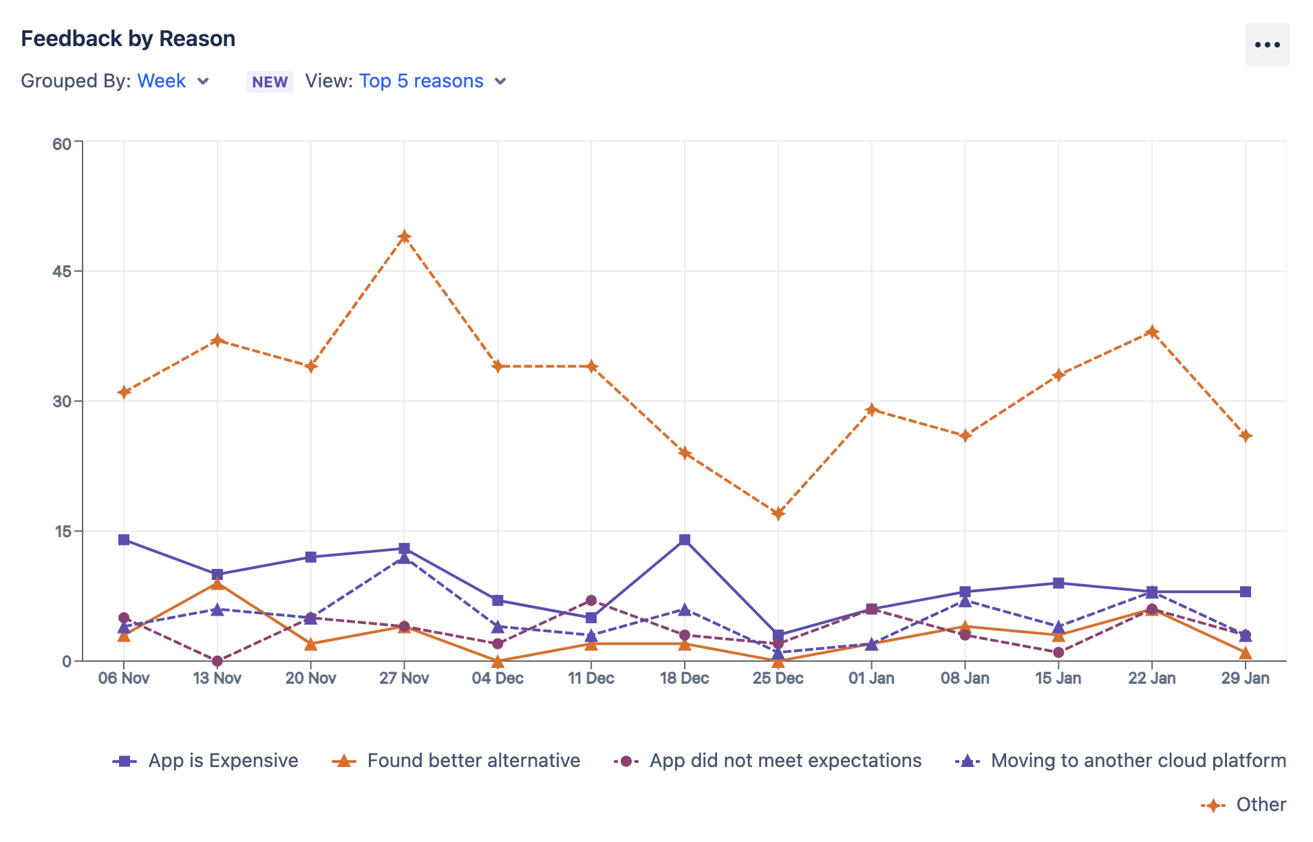
The feedback is charted on a time series graph where the Y-axis is the number of churns due to a particular reason or the number of churns of a particular type. Graph depicts the feedback based on the selected filter.
You can group the charts by week or month. While viewing the chart for feedback by reason, you can also customise the graph to show you the specific reasons (by default, the top 5 reasons are displayed).
You can also toggle the chart patterns from the three dots on the top right and change them for better accessibility.
Table
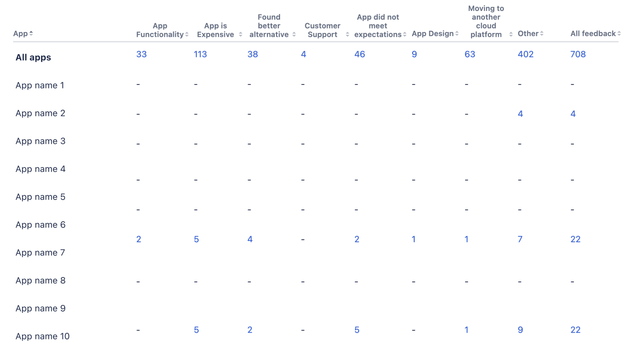
Within the table, your data is numerically displayed for all your apps as well as for specific apps.
Clicking on an amount on the table while you’re viewing your feedback will take you to the Feedback details report with those filters applied. For example, if you click on the number of churns for all your apps due to the reason App functionality, it will open the feedback detail for all your apps and show you all the churns that were done due to that reason.
For information about other terms used in the reports, check out the glossary.
Rate this page: